<?xml version="1.0" encoding="utf-8"?>
<feed xmlns="http://www.w3.org/2005/Atom">
    <id>https://measured.co</id>
    <title>Measured</title>
    <updated>2026-03-05T20:09:16.456Z</updated>
    <generator>https://github.com/jpmonette/feed</generator>
    <link rel="alternate" href="https://measured.co"/>
    <link rel="self" href="https://measured.co/feed.atom"/>
    <subtitle>Notes on the craft of UI and design systems.</subtitle>
    <logo>https://measured.co/social.png</logo>
    <icon>https://measured.co/favicon.ico</icon>
    <rights>All rights reserved 2026, Measured Corporation Ltd</rights>
    <entry>
        <title type="html"><![CDATA[Spotting UI icebergs: the complexity beneath the clicks]]></title>
        <id>https://measured.co/blog/ui-icebergs</id>
        <link href="https://measured.co/blog/ui-icebergs"/>
        <updated>2026-02-19T00:00:00.000Z</updated>
        <summary type="html"><![CDATA[Figma designs look real on the surface, but you have to look deeper. Here’s how teams can spot UI icebergs early to prevent unexpected budgetary headaches.]]></summary>
        <content type="html"><![CDATA[<p>The Figma designs are crisp. The interactions flow beautifully. Sign-off is painless. But when development begins, stickier questions can arise. What does this button actually do? What happens when that form fails? Who’s designing the empty state?</p>
<p>We call these hidden pieces of complexity UI icebergs. The bit above the surface is evident, but you have to look deeper to see the true scale of the work.</p>
<p>The trick is to make sure icebergs land on the radar before they cost unexpected time and money. Fortunately, there is a way.</p>
<h2 id="what-lies-beneath">What lies beneath</h2>
<p>During design, teams often zero in on primary flows, but can overlook the complexity behind the clicks. </p>
<p>The problem compounds as Figma designs look increasingly real. People forget that designs aren’t the thing, even if they look like it. They’re lossy. They don’t capture every implication.</p>
<p>As an example, say a public sector client has a website of services for homeowners, including checking eligibility for grants and calculating energy savings. The designs look straightforward: a few buttons on a landing page plus some simple navigation. Dev teams estimate a few weeks work.</p>
<p>But it turns out grant eligibility needs rule engines for property type, location and income. Energy calculations need building data, usage patterns, and local climate factors.</p>
<p>Each tool turns out to be a complete application in its own right. That would have been good to know in advance.</p>
<h2 id="iceberg-spotting-is-a-team-sport">Iceberg-spotting is a team sport</h2>
<p>In the waterfall days, designers assumed developers would figure out the details. Developers assumed designers would spec everything thoroughly. User experience fell into the gap in between.</p>
<p>The difference today? Ownership of different parts of the experience is still siloed, but there are more roles and disciplines in the mix, and usually more product complexity. So there are many more gaps for things to get lost in.</p>
<p>Take an online shopfront. One team handles product pages, another owns checkout. The product page team doesn’t think about what happens after you hit the buy button. The checkout team doesn’t think about how items arrived in the basket. Iceberg ahead!</p>
<p>There’s rarely any one person who understands, or is responsible for, the end-to-end journey who also has the bandwidth to find and address icebergs.<sup><a href="#user-content-fn-service-design" id="user-content-fnref-service-design" data-footnote-ref="" aria-describedby="footnote-label">1</a></sup> The team must get together and think through each journey.</p>
<h2 id="when-to-spot-icebergs">When to spot icebergs</h2>
<p>Ideally, you’ll catch icebergs during early design work. The surest way to find them is to gather everyone together and go through every element systematically. </p>
<p>Ask what’s behind each interaction — every link and every button. The response is often that it hasn’t been looked at yet, or it was presumed to be someone else’s responsibility. Iceberg discovered!</p>
<p>Behind that innocent-looking button could be a complete other web app, potentially more complicated than the one at the surface. It might be a system that doesn’t exist. Or it might need wholesale changes to support your proposal. It could be a third-party service that hasn’t been chosen yet.</p>
<p>You need to constantly review designs and consciously look for these hidden implications. A critical checkpoint is when the scope starts to become definitive. There’s no better time to ask whether it’s possible the team has overlooked massive piles of stuff.</p>
<p>Be sure to record every iceberg you discover, and remember that it shouldn’t automatically become the responsibility of the people that found it.</p>
<h2 id="risks-of-looking-the-other-way">Risks of looking the other way</h2>
<p>Fortunately, there isn’t a Titanic in this analogy to sink your project. The hidden work always appears eventually. </p>
<p>The risk is that you discover more work to do after you’ve committed to timelines and resources. Worst case, you complete a program and discover significant extra work at the end. </p>
<p>This is unlikely in practice as there are usually enough people who care to catch problems earlier. But unexpected icebergs can cause real budgetary headaches if they’re discovered too late.</p>
<p>Ultimately, the responsibility is collective and continuous throughout design. That way, delivery can remain a matter of execution rather than a series of unexpected discoveries.</p>
<section data-footnotes="" class="footnotes"><h2 class="sr-only" id="footnote-label">Footnotes</h2>
<ol>
<li id="user-content-fn-service-design">
<p>It’s an evolving discipline, but service design is starting to fill this gap. But in our experience service designers are often spread thinly across an organisation. And they’re not always empowered to referee when problems arise. <a href="#user-content-fnref-service-design" data-footnote-backref="" aria-label="Back to reference 1" class="data-footnote-backref">↩</a></p>
</li>
</ol>
</section>]]></content>
        <published>2026-02-19T00:00:00.000Z</published>
    </entry>
    <entry>
        <title type="html"><![CDATA[Why design systems fail]]></title>
        <id>https://measured.co/blog/why-design-systems-fail</id>
        <link href="https://measured.co/blog/why-design-systems-fail"/>
        <updated>2026-02-05T00:00:00.000Z</updated>
        <summary type="html"><![CDATA[Disaster is rare, but design systems often fail to meet the needs of the teams they’re meant to help. Here are 11 reasons why, and what to do to address them.]]></summary>
        <content type="html"><![CDATA[<p>Design systems fail for many reasons. Total disaster is rare. It’s more common that a project takes too long, or doesn’t serve the teams it’s meant to help.</p>
<p>Here are 11 reasons we’ve encountered:</p>
<ol>
<li>Scaling problems</li>
<li>Bias for the boardroom</li>
<li>Lack of consensus</li>
<li>Unclear ownership</li>
<li>Gaps in the technology stack</li>
<li>Inflexibility</li>
<li>Multi-brand complexity</li>
<li>Short reach</li>
<li>Pre-digital legacy</li>
<li>No organising principle</li>
<li>Unrealistic ambition</li>
</ol>
<p>Let’s take them one at a time, along with how we mitigate them.</p>
<ol>
<li>
<h2 id="scaling-problems">Scaling problems</h2>
<p>Small organisations have different ways of working to larger ones. If they don’t adapt as you grow, problems can arise.</p>
<p>If three teams use your design system, it’s easy to get feedback about a change. You can go and talk to them. If you have 30 teams, you need processes to make that work.</p>
<p>As you grow, watch for communication breakdowns and address them quickly.</p>
</li>
<li>
<h2 id="bias-for-the-boardroom">Bias for the boardroom</h2>
<p>External agencies sometimes build design systems for organisations, not with them.</p>
<p>The person making that buying decision usually isn’t responsible for the project’s success. The work might impress leadership, but not work for the teams saddled with it.</p>
<p>Instead, embed the agency into your organisation for as long as needed to understand teams’ needs and deliver the design system.</p>
</li>
<li>
<h2 id="lack-of-consensus">Lack of consensus</h2>
<p>Design system means different things to different people. It could encompass the brand, design elements and technology components. Or it might only cover typefaces and colours.</p>
<p>There’s no right definition, but different perceptions create risk. Agree on what problems to solve, and set the scope and goals to solve them.<sup><a href="#user-content-fn-build-what-you-need" id="user-content-fnref-build-what-you-need" data-footnote-ref="" aria-describedby="footnote-label">1</a></sup></p>
</li>
<li>
<h2 id="governance-challenges">Governance challenges</h2>
<p>Design systems often germinate in one team. That’s fine for a start, but if ownership stays there, it will only ever solve one team’s problems.</p>
<p>To succeed, the system must evolve from a team project to a shared infrastructure. The founding team shouldn’t dictate every detail, but they shouldn’t become a service desk either.</p>
<p>Instead, facilitate collaboration. Give all teams the means to contribute. They’ll be more invested in the system’s success if they help build it.</p>
<p>Support collaboration with:</p>
<ul>
<li>Version control</li>
<li>Pull requests</li>
<li>Documentation</li>
<li>Automated testing</li>
<li>Access control</li>
</ul>
</li>
<li>
<h2 id="gaps-in-the-technology-stack">Gaps in the technology stack</h2>
<p>It’s hard to make the design system work with all the technology used in the organisation. You may not have aligned around a technology stack, or decided not to. Maybe shadow IT is hiding in team workflows.</p>
<p>The design system doesn’t have to integrate with everything, but if it’s disconnected from essential parts, it won’t flourish.</p>
<p>Identify and agree necessary touchpoints to make sure all teams’ needs are met.</p>
</li>
<li>
<h2 id="inflexibility">Inflexibility</h2>
<p>Design systems fail when they don’t allow for change. Rebrands<sup><a href="#user-content-fn-scotts-law" id="user-content-fnref-scotts-law" data-footnote-ref="" aria-describedby="footnote-label">2</a></sup>, acquisitions and new needs arise. You can’t plan for every change, but an adaptable system prevents headaches.</p>
<p>If your organisation needs a design system, it’s likely to have different project teams working at different speeds. It’s not realistic for everyone to adopt the latest version of the design system on release.</p>
<p>If you don’t use a monorepo, use robust versioning. This helps teams make the best decisions for their project. We recommend <a href="https://semver.org/">Semantic Versioning</a> to flag the implications of an update for different teams. It flags mission-critical updates that affect existing implementations.</p>
</li>
<li>
<h2 id="multi-brand-complexity">Multi-brand complexity</h2>
<p>Managing several brands with one design system is complicated. You could be dealing with variations in theming or distinct identities. The design system must support each sub-brand’s uniqueness, and its cohesion with its siblings to the extent needed.</p>
<p>Identify where your needs fall on this spectrum. It gives you a reference point for decisions about what the design system should do — and how.</p>
</li>
<li>
<h2 id="short-reach">Short reach</h2>
<p>Design systems aren’t only for the web. To make your UI consistent, identify everywhere users interact with your brand. Then decide what your design system should include.</p>
<p>Consider:</p>
<ul>
<li>Web (desktop and mobile)</li>
<li>Native apps (desktop and mobile)</li>
<li>Emails</li>
<li>Social media</li>
<li>Support documentation</li>
<li>Digital advertising</li>
<li>Print, physical media and merchandise</li>
</ul>
<p>You don’t have to include everything at once. Web and mobile are a good place to start.</p>
</li>
<li>
<h2 id="pre-digital-legacy">Pre-digital legacy</h2>
<p>Your starting point could be a brand guide developed for print, or other non-digital contexts. You might inherit an inaccessible colour scheme, a typeface that doesn’t support internationalisation, or a logo that doesn’t work in digital contexts.</p>
<p>Some organisations overlook digital in their foundational strategy. This makes life hard for digital teams charged with implementing it. There’s also a risk of leaders underestimating the scale of moving to digital.</p>
<p>But it’s also an opportunity to modernise. Make sure your design, technology and other brand-aware teams are in the room from the start.</p>
</li>
<li>
<h2 id="no-organising-principle">No organising principle</h2>
<p>To build a Lego castle, buy a set, not a tub of random bricks. Without an organising principle, your design system could become a collection of things that aren’t used, or used in disparate ways.</p>
<p>The principle could be anything that helps you filter out ideas that won’t help you build what you need. For example:</p>
<ul>
<li>Composability: will it work consistently in different contexts?</li>
<li>Platform-specificity: e.g. should you build only with React?</li>
<li>Scalability: will it still work in a multi-brand future?</li>
</ul>
<p>Identify a logical organising principle for the aims of your project.</p>
</li>
<li>
<h2 id="unrealistic-ambition">Unrealistic ambition</h2>
<p>Design systems fail when you try to do too much too soon.</p>
<p>Don’t try to eat the whole horse. Start with foundational elements like fonts, icons, design tokens, or logos. Then pivot to the processes that get people to use them, talk about them, and share feedback.</p>
<p>It’s tempting to fork old design-system work, but that’s like taking your carpets with you when you move house. It won't achieve the best results.</p>
<p>Remember: anyone that has built a good design system had to build a bad one first.</p>
</li>
</ol>
<p>We’d love to hear your thoughts. Get involved on <a href="https://bsky.app/profile/measured.co/post/3l62wmib5qy2q">Bluesky</a> or <a href="https://www.linkedin.com/pulse/why-design-systems-fail-measuredco-ykrfe/">LinkedIn</a>.</p>
<section data-footnotes="" class="footnotes"><h2 class="sr-only" id="footnote-label">Footnotes</h2>
<ol>
<li id="user-content-fn-build-what-you-need">
<p>See <a href="https://measured.co/blog/dont-build-a-design-system">Don’t build a design system — build what you actually need</a>. <a href="#user-content-fnref-build-what-you-need" data-footnote-backref="" aria-label="Back to reference 1" class="data-footnote-backref">↩</a></p>
</li>
<li id="user-content-fn-scotts-law">
<p>See <a href="https://measured.co/blog/scotts-law-of-rebrands">Scott’s Law of Rebrands</a>, on the inevitability of rebrands happening, and how to plan for it. <a href="#user-content-fnref-scotts-law" data-footnote-backref="" aria-label="Back to reference 2" class="data-footnote-backref">↩</a></p>
</li>
</ol>
</section>]]></content>
        <published>2024-09-30T00:00:00.000Z</published>
    </entry>
    <entry>
        <title type="html"><![CDATA[Design systems that scale: the case for composability]]></title>
        <id>https://measured.co/blog/composability</id>
        <link href="https://measured.co/blog/composability"/>
        <updated>2025-12-16T00:00:00.000Z</updated>
        <summary type="html"><![CDATA[Composability is essential for UI systems at any scale, but often misunderstood. Here's how to make it the foundation of your design system.]]></summary>
        <content type="html"><![CDATA[<p>Many design systems eventually hit the same wall: By growing to accommodate every variation teams need, they become gruelling to maintain.</p>
<p>A designer needs a button with an icon on the right, not the left, for example. Or an engineer needs a modal that can nest inside another modal. And so on.</p>
<p>Soon enough, the system bends under the weight of prop after prop until it becomes harder to use than to work around. We see this pattern repeatedly on large-scale UI systems.</p>
<p>There is a solution: composability — a principle by which design systems continue to work well as they scale.</p>
<p>Composability should be a core principle when building UI, essential both for large systems and smaller systems with big ambition. But it’s poorly understood, and therefore often overlooked.</p>
<p>Here’s how to apply composability as the foundation of a successful, large-scale design system.</p>
<h2 id="organisation-by-technology--the-problem-composability-solves">Organisation by technology — the problem composability solves</h2>
<p>In early web development, the dominant approach was document-first. HTML, CSS and JavaScript were separated into distinct layers, each with its own concerns: structure, style and behaviour respectively. MarkoJS call this <a href="https://markojs.com/docs/explanation/separation-of-concerns">separation of concerns by technology</a>.</p>
<p>Many people still passionately believe in separation by technology, but this purity is unhelpful in modern contexts. Not least because both CSS and HTML have gained behavioural capabilities themselves.</p>
<p>At scale, with large teams working on different parts of complex applications, separation by technology struggles. A CSS change to fix one page mysteriously breaks another. A JavaScript tweak cascades through unrelated features.</p>
<p>The separation that should contain the complexity instead disperses it. When systems become overly dependent on each other across these boundaries, it's known as high coupling — the classic anti-pattern that keeps on giving.</p>
<h2 id="the-emergence-of-composability-or-organisation-by-functionality">The emergence of composability, or organisation by functionality</h2>
<p>Ironically, composability predates the web. It emerged as a principle in 1970s computer science and mid-20th century systems theory.<sup><a href="#user-content-fn-emergence-of-composability" id="user-content-fnref-emergence-of-composability" data-footnote-ref="" aria-describedby="footnote-label">1</a></sup> It involves building complex systems from smaller, self-contained parts with clear boundaries. It’s separation of concerns by functionality rather than technology.</p>
<p>Composability in this context means defining what a component does, how it relates to other components, and crucially, how it protects itself from unintended interactions. When done properly, parts can be reused, recombined, and updated without unintended side effects rippling through the system.</p>
<p>Modern JavaScript frameworks, particularly React, formalised this approach through component models. Each component keeps its own implementation close by, while staying small enough to be composed from and alongside others.</p>
<h2 id="why-its-powerful">Why it’s powerful</h2>
<p>For large organisations, composability isn't just a nice-to-have. It's the difference between a system that enables teams and one that obstructs them.</p>
<p>Composability reduces the need for cross-team coordination. Teams can work independently within well-defined boundaries, making parallel work possible without treading on each other’s toes.</p>
<p>Instead of negotiating every change, teams can simply get on with their bit. No more <code>@here</code> distraction bombs dropped into Slack.</p>
<p>It also makes updates safer and easier to test. Changes are contained, reducing the blast radius of bugs.</p>
<p>Conversely, when composability is overlooked, teams tend to work around the system. As a result, bad things happen:</p>
<ul>
<li>Designers <a href="https://help.figma.com/hc/en-us/articles/360038665754-Detach-an-instance-from-the-component">detach components</a> from the system and retreat into Figma, widening the gap between design and implementation<sup><a href="#user-content-fn-component-health" id="user-content-fnref-component-health" data-footnote-ref="" aria-describedby="footnote-label">2</a></sup></li>
<li>Engineers fork components or rebuild from scratch, fragmenting the codebase</li>
<li>Component APIs accumulate baroque collections of props (<code>showIconLeft</code>, <code>showIconRight</code>, <code>iconLeftSize</code>, <code>iconRightSize</code>, <code>iconLeftColor</code>…)</li>
<li>Styles and behaviours become context-dependent and unpredictable</li>
</ul>
<p>A composable system prevents these outcomes. Components can be assembled with confidence, and behaviour remains consistent regardless of context.</p>
<h2 id="the-composabilityconfiguration-continuum">The composability–configuration continuum</h2>
<p><strong>Note:</strong> This section contains contrived examples for purely illustrative purposes.</p>
<p>Composability and configuration aren't mutually exclusive. They represent different points on a spectrum, each with distinct trade-offs.</p>
<p>At the configuration end, teams extend functionality through props and toggles. A typical configuration-based button might look like:</p>
<pre><code class="language-jsx">&#x3C;<span class="hljs-title">Button</span> 
  icon=<span class="hljs-string">"arrow"</span>
  iconPosition=<span class="hljs-string">"right"</span> 
  size=<span class="hljs-string">"large"</span>
  variant=<span class="hljs-string">"primary"</span> 
/>
</code></pre>
<p>It's intuitive and requires minimal learning. But configuration doesn't scale gracefully. Each new requirement adds props. Each prop increases testing and maintenance overhead. Performance degrades. The API becomes harder to reason about.</p>
<p>At the composability end, systems provide smaller, general-purpose building blocks that teams combine. Instead of a <code>Button</code> component with an <code>icon</code> prop, you might have:</p>
<pre><code class="language-jsx">&#x3C;<span class="hljs-title">Button</span>>
  <span class=""><span class="hljs-tag">&#x3C;<span class="hljs-name">ButtonText</span>></span>
    Continue
  <span class="hljs-tag">&#x3C;/<span class="hljs-name">ButtonText</span>></span></span>
  <span class=""><span class="hljs-tag">&#x3C;<span class="hljs-name">ButtonIcon</span>></span>
    <span class="hljs-tag">&#x3C;<span class="hljs-name">Arrow</span> /></span>
  <span class="hljs-tag">&#x3C;/<span class="hljs-name">ButtonIcon</span>></span></span>
&#x3C;/<span class="hljs-title">Button</span>>
</code></pre>
<p>The trade-off is that it requires more discipline up front. Teams must understand how components fit together.</p>
<p>But it scales better: new requirements are handled through new combinations of existing parts rather than adding new props. The component stays simple and the API stays stable.</p>
<p>Most systems land somewhere between these extremes. But composability serves as a useful north star. A well-designed composable system makes the right thing easy and the wrong thing difficult — not through restriction, but through sensible defaults and clear APIs.</p>
<h2 id="designing-composable-systems">Designing composable systems</h2>
<p>Designing for composability demands intention.</p>
<p>Key principles include:</p>
<p><strong>Co-locate structure, style and logic:</strong> Everything related to a component should live together.</p>
<p><strong>Support internal composition:</strong> Design components that accept children, use slot patterns, or provide sub-components that work together.</p>
<p><strong>Create clear, documented prop APIs:</strong> Every prop should have clear purpose, naming and type constraints. Avoid generic escape hatches like <code>className</code> or <code>style</code> props that allow arbitrary overrides.</p>
<p><strong>Use explicit prop types and validation:</strong> TypeScript interfaces or PropTypes that make correct usage obvious and incorrect usage difficult.</p>
<p><strong>Choose sensible defaults:</strong> Defaults that encourage correct usage without requiring configuration.</p>
<p>Composability is less about building a perfect system and more about designing for change. It allows systems to evolve safely. Versioning makes it possible to release early, gather data from real-world use, and iteratively improve.</p>
<h2 id="learning-from-existing-systems">Learning from existing systems</h2>
<p>Existing design systems can provide useful reference points. It’s often said that teams need to build a bad design system before they can build a good one. Reviewing what’s already out there can accelerate that learning process.</p>
<p>There are many well-documented public design systems available. Building small features with them is a good way to see how composable patterns behave, and how boundaries are defined and respected in actual use.</p>
<p><a href="https://www.radix-ui.com/">Radix UI</a> provides unstyled, accessible components built on composition. <a href="https://mui.com/material-ui/">Material UI</a>, <a href="https://ant.design/">Ant Design</a> and <a href="https://carbondesignsystem.com/">Carbon</a> similarly show different approaches to balancing composition and configuration. <a href="https://primer.style/">Primer</a> demonstrates how composability works in a large, multi-platform system.</p>
<h2 id="adopting-composability">Adopting composability</h2>
<p>It’s possible to shift from a configuration-heavy system to a more composable one, but it’s rarely straightforward. You can't simply deprecate the old and ship the new.</p>
<p>You often end up with two systems living side by side: one designed for configuration, the other for composition. This creates confusion and duplication. You carry the baggage of the old system for a long time — maybe forever.</p>
<p>In cases where existing systems must remain in place — what we call heritage systems — pragmatic workarounds may be necessary. But where new systems can be introduced, composability should be the starting point.</p>
<p>Strategies that help:</p>
<p><strong>Version new components separately:</strong> Make it clear which components represent the new approach, reducing confusion about which to use.</p>
<p><strong>Document thoroughly:</strong> Don't assume teams will figure things out. Provide concrete examples of translating old patterns to new ones.</p>
<p><strong>Accept coexistence of systems:</strong> Fighting the reality burns goodwill and slows adoption.</p>
<h2 id="start-small">Start small</h2>
<p>If composability is new territory for your team, don’t rush into a big commitment.</p>
<p>Here are things you can do in the early stages:</p>
<p><strong>Audit a problematic component:</strong> This might be a button, card, or modal with dozens of props. Map which props are actually used, which conflict, and which are workarounds. This reveals where configuration has failed.</p>
<p><strong>Sketch a composable alternative:</strong> How would you rebuild it using composition? You don't need to implement it. Just design the API. What becomes simpler? What becomes harder?</p>
<p><strong>Build a pilot component:</strong> Choose something new rather than a replacement for existing work. A feature that needs a component the system doesn't provide yet. Build it composably from the start.</p>
<p><strong>Review an established system:</strong> Pick an established public design system. Build a small feature with it. Notice what feels natural, what feels awkward, how the pieces fit together.</p>
<p><strong>Share your learning:</strong> Document what you've learned. Show examples. Build shared understanding before attempting larger changes.</p>
<h2 id="worth-the-effort">Worth the effort</h2>
<p>Composability is not a new idea. It’s a practical principle that supports maintainability, development speed, and consistency — particularly in complex environments.</p>
<p>It requires clarity of intent, thoughtful design, and a willingness to change how teams work. But the investment is worth it to build more resilient systems that you can iterate faster, and which your teams can trust without working around.</p>
<p>We’d love to hear your thoughts. Get involved on <a href="https://bsky.app/profile/measured.co/post/3mab4ragpgs2y">Bluesky</a> or <a href="https://www.linkedin.com/pulse/design-systems-scale-case-composability-measuredco-wvrxe/">LinkedIn</a>.</p>
<section data-footnotes="" class="footnotes"><h2 class="sr-only" id="footnote-label">Footnotes</h2>
<ol>
<li id="user-content-fn-emergence-of-composability">
<p>Inessential reading rabbit hole: Ludwig von Bertalanffy’s <a href="https://www.goodreads.com/book/show/1096749.General_System_Theory"><em>General system theory: foundations, development, applications</em></a> (1968), David Parnas’s <a href="https://dl.acm.org/doi/10.1145/361598.361623"><em>On the criteria to be used in decomposing systems into modules</em></a> (1972), John Backus’s <a href="https://dl.acm.org/doi/10.1145/800223.806757"><em>Function level programs as mathematical objects</em></a> (1981). <a href="#user-content-fnref-emergence-of-composability" data-footnote-backref="" aria-label="Back to reference 1" class="data-footnote-backref">↩</a></p>
</li>
<li id="user-content-fn-component-health">
<p>In <a href="https://www.salesforce.com/blog/figma-component-health/">Don’t Detach: Why Figma Component Health Matters</a>, Salesforce’s Lightning Design System team identifies detaching as a critical threat to design system health. <a href="#user-content-fnref-component-health" data-footnote-backref="" aria-label="Back to reference 2" class="data-footnote-backref">↩</a></p>
</li>
</ol>
</section>]]></content>
        <published>2025-12-16T00:00:00.000Z</published>
    </entry>
    <entry>
        <title type="html"><![CDATA[UI components as Lego: an analogy too far, or not far enough?]]></title>
        <id>https://measured.co/blog/ui-lego-analogy</id>
        <link href="https://measured.co/blog/ui-lego-analogy"/>
        <updated>2025-12-04T00:00:00.000Z</updated>
        <summary type="html"><![CDATA[A box of UI bricks only gets you so far. What happens when product teams need parts that don't exist? Time to examine the Lego analogy more closely.]]></summary>
        <content type="html"><![CDATA[<p>The UI Lego analogy is always good for an eye-roll. Components are bricks. Product teams build things with them. An apple a day. Red sky at night.</p>
<p>But if it wasn’t valid, it wouldn’t have persisted long enough to grow stale.</p>
<p>Is it still useful? We say it is — if you extend it, that is. Because having a nice set of bricks is no longer enough.</p>
<h2 id="an-incomplete-picture">An incomplete picture</h2>
<p>Here’s a common model for building complex things on the web:</p>
<ol>
<li>A central UI team builds the components</li>
<li>Product teams assemble experiences from them</li>
</ol>
<p>This scenario can reduce the design system to a fixed library of components.</p>
<p>Product teams choose from the box of pieces and fit them together. But it only includes pieces for the product needs you can see this side of the horizon.</p>
<p>A Lego set is perfect for building one thing. But when you’re finished, someone’s going to want to turn it into something better. There comes a time when the product team will need something that doesn’t exist yet. What then?</p>
<h2 id="beyond-the-manual">Beyond the manual</h2>
<p>A good design system doesn’t only provide components. It enables teams to create new ones.</p>
<p>This raises an obvious tension: if product teams can build their own things, how do you maintain quality and consistency? Who maintains it? Who prevents chaos?</p>
<p>There's no one answer, but there is a <a href="https://measured.co/blog/continuums-as-a-tool">continuum</a> of options. At one end, you have complete lockdown: the UI team controls everything, making outside contributions difficult, if not impossible.</p>
<p>At the other, you have federation: anyone can add anything in the name of community ownership — which tends to mean no ownership. Quality becomes inconsistent and the system fragments.<sup><a href="#user-content-fn-federation-fallacy" id="user-content-fnref-federation-fallacy" data-footnote-ref="" aria-describedby="footnote-label">1</a></sup></p>
<p>We find that successful systems start out with strict controls. Clear standards facilitate the rapid progress you need to show early on.</p>
<p>But to grow well, they need to gradually open up as they mature. That doesn’t mean phasing out control. It means putting governance systems in place. Create documented processes and controls for ownership, contribution and deprecation.</p>
<p>Maintaining over-rigid control indefinitely creates problems. Product teams build what they need anyway, outside the system. Shadow components proliferate. The design system becomes gradually less useful in enabling the work being done.</p>
<p>When you add means of both enablement and governance to your collection of components, you elevate it to a full-fledged design system. That is, it becomes a system of systems.<sup><a href="#user-content-fn-design-system-ecosystem" id="user-content-fnref-design-system-ecosystem" data-footnote-ref="" aria-describedby="footnote-label">2</a></sup></p>
<h2 id="in-the-shadows">In the shadows</h2>
<p>Shadow components aren’t to be feared. They’re useful signals, not least that you have a motivated team that wants to get things done.</p>
<p>But they also signal that the system isn’t meeting all needs. That could be because the contribution process is hard to understand, onerous to follow, or both.</p>
<p>Ask what problem they were trying to solve and why the existing system didn’t work for them. The answer will reveal gaps to fill.</p>
<h2 id="making-it-work">Making it work</h2>
<p>Your design tokens, icons, and foundational elements need to be available in every format the teams use, be that CSS custom properties, JSON, JavaScript, or any other.</p>
<p>Documentation should cover both how to use and build components, structured around different user needs.<sup><a href="#user-content-fn-diataxis" id="user-content-fnref-diataxis" data-footnote-ref="" aria-describedby="footnote-label">3</a></sup></p>
<p>Everything should live in one place rather than scattered across repos, wikis and Slack channels.</p>
<p>The payoffs are substantial:</p>
<ul>
<li>Teams stop wasting time rebuilding primitives.</li>
<li>Consistency becomes the default rather than an aspiration.</li>
<li>Brand identity holds together.</li>
<li>Development speed increases because new problems are only new once — when they arise again, you’ve already solved them.</li>
</ul>
<h2 id="building-on-the-lego-analogy">Building on the Lego analogy</h2>
<p>These benefits only materialise when you move beyond the component catalogue model.</p>
<p>The Lego analogy holds – but only if your teams can tool up and make new bricks. The goal isn’t to provide every possible component. It's to provide foundational components plus the means to create more.</p>
<p>In other words, you’ve built a beautiful Lego factory. Now it’s time to hand out the golden tickets.</p>
<p>We’d love to hear your thoughts. Get involved on <a href="https://bsky.app/profile/measured.co/post/3mdfja7emhc2w">Bluesky</a> or <a href="https://www.linkedin.com/pulse/ui-components-lego-analogy-too-far-enough-measuredco-c4wye/">LinkedIn</a>.</p>
<section data-footnotes="" class="footnotes"><h2 class="sr-only" id="footnote-label">Footnotes</h2>
<ol>
<li id="user-content-fn-federation-fallacy">
<p>See Nathan Curtis’s <a href="https://medium.com/@nathanacurtis/the-fallacy-of-federated-design-systems-23b9a9a05542">The fallacy of federated design systems</a>, on the “damage and distress of glorifying the wrong model”. <a href="#user-content-fnref-federation-fallacy" data-footnote-backref="" aria-label="Back to reference 1" class="data-footnote-backref">↩</a></p>
</li>
<li id="user-content-fn-design-system-ecosystem">
<p>Brad Frost's <a href="https://bradfrost.com/blog/post/the-design-system-ecosystem/">The design system ecosystem</a> breaks down how design systems are ecosystems of interconnected parts all working together. The component library is just one piece. <a href="#user-content-fnref-design-system-ecosystem" data-footnote-backref="" aria-label="Back to reference 2" class="data-footnote-backref">↩</a></p>
</li>
<li id="user-content-fn-diataxis">
<p>The <a href="https://diataxis.fr/">Diataxis</a> framework structures documentation around four distinct user needs: tutorials, how-to guides, explanations of concepts, and reference material. It’s a great starting point for planning documentation. <a href="#user-content-fnref-diataxis" data-footnote-backref="" aria-label="Back to reference 3" class="data-footnote-backref">↩</a></p>
</li>
</ol>
</section>]]></content>
        <published>2025-12-04T00:00:00.000Z</published>
    </entry>
    <entry>
        <title type="html"><![CDATA[Start with a slice: 7 steps to get your new design system moving]]></title>
        <id>https://measured.co/blog/design-system-slice</id>
        <link href="https://measured.co/blog/design-system-slice"/>
        <updated>2025-10-09T00:00:00.000Z</updated>
        <summary type="html"><![CDATA[Design system projects often stall because teams start too broadly to make progress. Here's how to pick a narrow slice that shows value in weeks, not months.]]></summary>
        <content type="html"><![CDATA[<p>Getting a design system off the ground is hard. Teams often start too broadly. Without a concrete goal, it's easy to get stuck weighing up the options.</p>
<p>In this post we share how to take a more focused approach by choosing a narrow slice to build to show value quickly.</p>
<ol>
<li>
<h2 id="start-with-a-visible-bounded-slice">Start with a visible, bounded slice</h2>
<p>Choose one or two target pages to begin with. These pages should be highly visible but clearly bounded. You want a manageable scope, but also show an immediate impact.</p>
<p>A focused slice helps reveal the right problems early and demonstrates progress everyone can see. </p>
<p>The homepage is often a strong choice. It’s rarely representative on its own, but it's often politically non-negotiable. People will inevitably ask, “… but what about the homepage?” Including it is a pragmatic way to avoid hassle.</p>
<p>Pairing it with a second, more typical page helps make sure you're solving recurring problems. This could be a product listing or dashboard, for example.</p>
<p>Avoid pages that make heavy use of overlays or modals. That’s too much complexity, too early.</p>
</li>
<li>
<h2 id="build-a-shadow-world-with-storybook">Build a shadow world with Storybook</h2>
<p>Create a shadow world. Recreate your product in a low-stakes space your team owns. It’s not live. It’s not connected to real data. It doesn’t need to be perfect. It’s a place to explore and demonstrate what your design system can do.</p>
<p>Set up a <a href="https://storybook.js.org/">Storybook</a> environment to develop and present components without delivery pressure. This removes risk by letting you experiment, validate decisions and get buy-in before touching production code.</p>
<p>Storybook lets you test components in isolation, explore states and variants, and prototype static pages. This creates a shared frame of reference and enables fast iteration.</p>
</li>
<li>
<h2 id="categorise-your-components-deliberately">Categorise your components deliberately</h2>
<p>Next, analyse your target page. Divide what you see into three categories:</p>
<p><strong>Potential design system components:</strong> Reusable patterns like buttons, cards or form fields. <br>
<strong>Site furniture:</strong> Recurring structural elements like headers, footers, and navigation. <br>
<strong>Custom components:</strong> Unique, often complex, items.</p>
<p>Design tokens tie all three together with consistent styling. This resists the trap of becoming the department responsible for all the things rather than a team that enables others.</p>
</li>
<li>
<h2 id="decide-what-to-tackle-and-what-to-park">Decide what to tackle and what to park</h2>
<p>Be strict about scope. Account for layout mechanics and logic underpinning visible components. Keep a list of future needs, but resist tackling them now. (This makes a great starting point for an <a href="https://measured.co/blog/opportunity-roadmaps">opportunity roadmap</a>.)</p>
<p>Look out for what we call icebergy components: seemingly simple elements that hide complexity. For example, a bell icon might open a complex messaging panel. A text input requires validation states, complex accessibility features, and error handling.</p>
<p>Start with the simplest version that works. You can always add complexity later, but you can't ship if you try to solve every edge case upfront.</p>
</li>
<li>
<h2 id="list-components-then-order-your-steps">List components, then order your steps</h2>
<p>List the components needed for your target page. Group them by type. Start with something basic like a button. Jot down what it needs to get it working.</p>
<p>This simple exercise reveals more than you'd expect. Particularly if you're new to design systems, or if your role isn’t hands on. it surfaces foundational work that wasn't on your radar. You'll discover you need to:</p>
<ul>
<li>Define and create a starter set of design tokens</li>
<li>Set up tooling: code repositories, Storybook deployments, tests</li>
<li>Figure out versioning and publishing</li>
<li>Write basic getting started docs</li>
<li>Factor in cross-cutting concerns like accessibility, security, and internationalisation</li>
</ul>
<p>One by one, move to the next component, noting only new tasks. The net-new work shrinks rapidly as foundational elements fall into place.</p>
<p>This approach reveals everything you need for an alpha release and exposes hidden complexity early so you can plan for it rather than scramble.</p>
</li>
<li>
<h2 id="create-the-right-conditions">Create the right conditions</h2>
<p>This approach demands a collaborative, cross-functional team. It helps to have T-shaped people: developers who care about design and designers with technical empathy. </p>
<p>You need a shared mindset embracing modern product development. Without it, teams fall back into old patterns. Design becomes a one-off handover rather than a collaboration, and the whole approach fails.</p>
<p>Set expectations: progress and learning in tandem are key.</p>
</li>
</ol>
<h2 id="clarity-momentum-and-progress">Clarity, momentum, and progress</h2>
<p>A narrow, visible slice gives your team a shared focus and a tangible goal. It helps you solve the right problems early, without overthinking.</p>
<p>The trick isn't having all the answers upfront. It's building something real that teaches you what questions to ask next. Get your slice working, and momentum takes care of the rest.</p>]]></content>
        <published>2025-10-09T00:00:00.000Z</published>
    </entry>
    <entry>
        <title type="html"><![CDATA[Continuums as a tool for understanding]]></title>
        <id>https://measured.co/blog/continuums-as-a-tool</id>
        <link href="https://measured.co/blog/continuums-as-a-tool"/>
        <updated>2025-09-30T00:00:00.000Z</updated>
        <summary type="html"><![CDATA[Complex problems rarely have tidy answers. The continuum is a powerful tool to shift from grasping for quick fixes to finding a considered, effective approach.]]></summary>
        <content type="html"><![CDATA[<p>People are natural problem-solvers. We like to fix things. So when we’re faced with a complex problem, it’s not surprising that we want to solve it. Usually in the fastest and best way possible.</p>
<p>But there’s risk in trying to fix the whole problem at once. For one, it can make it very difficult to know where to start, which often leads to a form of paralysis. People naturally bounce on to more readily-solvable problems instead.</p>
<p>Almost always, it helps to step back to visualise the range of possibilities. This is where the idea of a continuum can be a powerful tool in understanding. It helps move from reflexive solutionising to a more considered approach.</p>
<h2 id="diy-as-a-spectrum">DIY as a spectrum</h2>
<p>As an example, think of renovating a room at home.</p>
<p>At one end of the spectrum, you could handle every aspect of the project yourself. It’s the most time-consuming option, but it will save a lot of money. It's also difficult, and might lead to a less good outcome. (No offence.)</p>
<p>At the other end, you could pay to outsource the whole project to relevant trades. Expensive, but it does give you time back, and should lead to the best results.</p>
<p>But, assuming you have some time and money, you might look at a sensible middle ground. You could get a professional in to handle the tricky job of plastering the walls, but take on the painting yourself.</p>
<p>The mental model of the continuum helps to map out the interesting options between the extremes. In our experience, the ends of the spectrum rarely lead to a pot of gold.</p>
<h2 id="multi-brand-design-systems-as-a-continuum">Multi-brand design systems as a continuum</h2>
<p>In our world, multi-brand design systems are a great example of the usefulness of the continuum. When an organisation has more than one brand, what’s the best way to approach a new or evolving design system? Should you have one system or many?</p>
<p><strong>Note:</strong> We’re talking about brands here, but the same goes for multiple products or product groups. (Contextual re-nouning is encouraged.)</p>
<p>Instead of approaching this as a binary choice, you can plot a range of different approaches on an axis.</p>
<p>At one end you have simple theming. This means one design system to rule them all, switching out logos and colour schemes for each brand. It’s a fast and efficient approach, but the trade-off is limited brand differentiation.</p>
<p>At the other end, the organisation has multiple siloed design systems. Nothing is shared between them, be that code bases, components or anything else. Each brand has total independence, but at the expense of efficiency.</p>
<p>Somewhere in the middle is a multi-brand approach built on one system. You have the benefits of shared architecture and flexibility in brand differentiation. The benefits and trade-offs are more balanced.</p>
<p>Figuring out the best approach means arriving at how far along the continuum you want to land. How much flexibility do you need? How much time and effort do you want to commit to? Pinning the options to a continuum (real or imaginary) helps everyone understand the trade-offs.</p>
<h2 id="why-continuums-work">Why continuums work</h2>
<p>Thinking about this continuum isn’t an abstract exercise. It’s a practical method with real benefits:</p>
<p><strong>It prevents hasty decisions:</strong> It encourages teams to pause and consider a number of alternatives beyond those that first spring to mind.</p>
<p><strong>It helps you see the possibilities:</strong> It simplifies complex problems by providing an objective framework for comparison.</p>
<p><strong>It fosters a considered consensus:</strong> The continuum makes it clear that there's no single correct answer. Each option has its pros and cons, and the best choice depends on the specific circumstances. This opens up a more nuanced conversation about trade-offs and helps everyone buy into a way forward.</p>
<h2 id="its-all-about-trade-offs">It’s all about trade-offs</h2>
<p>We often say that all decisions are trade offs. In fact, we probably should have written that post first. Continuums are a tool for understanding and talking about those trade offs.</p>
<p>It’s much easier than thinking about stand-alone alternatives. Plus you get to make funny hand gestures when you explain things. 🫲 🫱</p>
<p>We’d love to hear your thoughts. Get involved on <a href="https://bsky.app/profile/measured.co/post/3m24uyvs6ac2y">Bluesky</a> or <a href="https://www.linkedin.com/pulse/continuums-tool-understanding-measuredco-gtrye/">LinkedIn</a>.</p>]]></content>
        <published>2025-09-30T00:00:00.000Z</published>
    </entry>
    <entry>
        <title type="html"><![CDATA[Problems with font distribution, and why versioning matters]]></title>
        <id>https://measured.co/blog/font-distribution-problems</id>
        <link href="https://measured.co/blog/font-distribution-problems"/>
        <updated>2025-07-01T00:00:00.000Z</updated>
        <summary type="html"><![CDATA[When we rebuilt the Measured site, we didn’t expect fonts to be a problem. But meeting our requirements while keeping file sizes down became a bit of a mission.]]></summary>
        <content type="html"><![CDATA[<p>When we <a href="https://measured.co/blog/new-visual-identity">refreshed the Measured visual identity</a>, a website rebuild was always part of that scope.</p>
<p>We expected to make some careful typographic refinements in that process. But what followed was an unexpected deep dive into how fonts are distributed and integrated into modern web infrastructure.</p>
<p>This is an account of what we encountered, the choices we made, and some thoughts that may be relevant to teams using fonts — and those making and distributing them. We’ve gone quite heavy with hyperlinks by way of explaining terms if needed.</p>
<p><strong>Note:</strong> Though true when we were rebuilding the site around December 2024, some of the detail of what follows has since changed. I’ve done my best to call this out when that’s the case. Hopefully the broader thrust is still useful.</p>
<h2 id="the-plan">The plan</h2>
<p>When we embarked on the brand refresh and site rebuild, we landed on <a href="https://rsms.me/inter/">Inter</a> for its <a href="https://dev.to/dog_smile_factory/5-reasons-to-give-inter-fonts-a-try-46i2">many benefits</a> — readability and ease of implementation among them.</p>
<p>We wanted to use <a href="https://nextjs.org/docs/pages/building-your-application/optimizing/fonts#google-fonts"><code>next/font/google</code></a> to implement the Inter Google Font for its magical ways of optimising font performance. We wanted a fast site with green <a href="https://developer.chrome.com/docs/lighthouse/overview">Lighthouse</a> scores. (Along with images, custom fonts are a major cause of poor site performance.)</p>
<p>But when we came to implementation, we ran into some blockers:</p>
<ol>
<li>Inter on Google Fonts didn’t have some OpenType features and glyphs that we wanted (rounded “quotes” and commas, for example)</li>
<li>Google Fonts not having Inter Italic at all (true at the time, but no longer<sup><a href="#user-content-fn-inter-italic" id="user-content-fnref-inter-italic" data-footnote-ref="" aria-describedby="footnote-label">1</a></sup>)</li>
</ol>
<h2 id="inter-vention-needed">Inter-vention needed</h2>
<p>So - how best to optimally integrate Inter (Italic) with Next.js if it's not available as a Google Font?</p>
<p>Our answer was to use <a href="https://nextjs.org/docs/pages/building-your-application/optimizing/fonts#local-fonts"><code>next/font/local</code></a>, a feature that provides similar font optimisations to next/font/google, but for self-hosted font files.</p>
<p>But though this method worked, performance was significantly downgraded compared to using Google Fonts, and Lighthouse scores were distinctly non-green.</p>
<p>There were a couple of reasons for this:</p>
<ol>
<li>Downloading Inter from Rasmus’ site offers no way to subset, meaning that our self-hosted Inter files were very large (weighing in at 740kb combined)</li>
<li>It turns out <code>next/font/local</code> doesn’t optimise quite as well as <code>next/font/google</code>, which leverages Google's CDN caching</li>
</ol>
<p>Like the good stoics we are, we dialled into problem 1 as being within our power to affect, so we looked to subset the fonts as aggressively as possible to reduce the file size and get us back into the green.</p>
<p>After much trial and error, we eventually managed to subset the two Inter files so that they had all the glyphs we needed while remaining as small as possible. To do this, we used <a href="https://github.com/fonttools/fonttools">fontTools</a> to try various subsetting and optimising techniques, and <a href="https://fontdrop.info/">FontDrop</a> to test the output.</p>
<p>In the end we arrived at this command line magic spell:</p>
<pre><code class="language-bash">pyftsubset InterVariable.ttf \
--unicodes=U+0000,U+0020-007E,U+00A0-00AC,U+00AE-00FF,U+0131,\
U+0152-0153,U+02BB-02BC,U+02C6,U+02DA,U+02DC,U+0300-0301,\
U+0303-0304,U+0308-0309,U+0323,U+2002,U+2009,U+200B,U+2013-2014,\
U+2018-201A,U+201C-201E,U+2022,U+2026,U+2032-2033,U+2039-203A,\
U+2044,U+2074,U+20AC,U+2122,U+2190,U+2191,U+2192,U+2193,U+2212,\
U+FEFF --flavor=woff2 \
--layout-features=calt,ccmp,dnom,frac,kern,locl,mark,mkmk,numr,ss03
</code></pre>
<p>The result was that our self-hosted files had a combined size of 144kb and Lighthouse performance scores were back in the green — not quite as good as they would have been with Google Fonts, but green nonetheless.</p>
<p>Most importantly: our site speed was fast again, and with the custom-designed true Italics and all the other typographical nuances we were after.</p>
<h2 id="the-need-for-font-versioning">The need for font versioning</h2>
<p>So how does this lead us to font versioning?</p>
<p>A good example is that Inter 3 didn’t have a separate file for Italics as they were handled with a variable font slant axis. When Inter 4 removed this variable axis and replaced it with a completely separate and custom designed Italic file, it took — and is still taking — tools a long time to catch up.</p>
<p>And because font versioning isn't really considered, someone using Inter from Google Fonts would have their italics switched from the variable font slant axis in Inter 3, to faux italics with Inter 4 overnight.</p>
<p>And all this without really any visibility. Google Fonts doesn't announce version changes, or even show the font version (at least not clearly that we can find — answers on a postcard).</p>
<p>To double check what version they were serving, we had to use FontDrop. So you really need to be tuned in to the font’s release history, and to typographical nuances in general, to have any idea about this.</p>
<p>Though it was a mission, digging into the details paid off for us. We were able to achieve the typographic clarity we wanted without significantly compromising performance.</p>
<p>We’d love to hear your thoughts. Get involved on <a href="https://bsky.app/profile/measured.co/post/3lonib3n6w22z">Bluesky</a> or <a href="https://www.linkedin.com/pulse/problems-font-distribution-why-versioning-matters-measuredco-dehse/">LinkedIn</a>.</p>
<section data-footnotes="" class="footnotes"><h2 class="sr-only" id="footnote-label">Footnotes</h2>
<ol>
<li id="user-content-fn-inter-italic">
<p>Google Fonts now has all the Inter OpenType features and glyphs, plus Inter Italic, so the original problem is nearly solved. However, at time of writing, <code>next/font/google</code> still does not include Inter Italic. Hopefully it will be added in future — we should probably open a pull request! <a href="#user-content-fnref-inter-italic" data-footnote-backref="" aria-label="Back to reference 1" class="data-footnote-backref">↩</a></p>
</li>
</ol>
</section>]]></content>
        <published>2025-04-24T00:00:00.000Z</published>
    </entry>
    <entry>
        <title type="html"><![CDATA[In praise of opportunity roadmaps]]></title>
        <id>https://measured.co/blog/opportunity-roadmaps</id>
        <link href="https://measured.co/blog/opportunity-roadmaps"/>
        <updated>2025-06-05T00:00:00.000Z</updated>
        <summary type="html"><![CDATA[How do you avoid your roadmap becoming an organisational wish list, with concrete deadlines and complex interdependencies? The key is evolution, not prediction.]]></summary>
        <content type="html"><![CDATA[<p>Product roadmaps are a fact of life. They’re a good way to set strategy, and communicate progress.</p>
<p>But without care, they can become an albatross, burdening teams under the weight of hard deadlines and sprawling interdependencies.</p>
<p>But they don’t need to be. Sometimes you just need to know:</p>
<ul>
<li>What’s happening now</li>
<li>What you think will happen next</li>
<li>What you’ve done</li>
<li>What you might do later</li>
</ul>
<p>We recommend opportunity roadmaps to stay lean and adaptable. Here’s why we like them, and how we use them.</p>
<h2 id="what-a-roadmap-is-and-why-you-need-one">What a roadmap is, and why you need one</h2>
<p>First, the basics. A product roadmap is a visual, strategic document that shows work that is happening now, and which might happen in future.</p>
<p>A good roadmap does two things. It helps the team prioritise what to do next. And it acts as a tool for transparent communication: it helps teams and stakeholders understand the status of the project, and its direction of travel.</p>
<p>There are many kinds of roadmap, which fall on a spectrum from lightweight to heavy-duty. At the latter end are the traditional roadmaps. These typically set out a linear plan, far into the future, mapping timelines and dependencies. They may also include KPIs.</p>
<p>At the other end, the case is sometimes made that you don’t need a roadmap at all. The rationale tends to be that good ideas always come back round, and next priority will always be clear.</p>
<p>Having no roadmap might work for single-product startups, it’s unlikely to fly in most organisations — with good reason. It’s perfectly reasonable that stakeholders in larger organisations keep tabs on what’s happening now and next — especially those ultimately responsible for the success of the project, who need to report on progress to higher-ups.</p>
<p>Much like our thinking behind <a href="https://measured.co/blog/kanban-not-scrum">why we use Kanban, not Scrum</a>, we advocate for lightweight roadmaps. They maintain flexibility, which avoids locking the team into the wrong priorities. But they still communicate the strategy, reassuring everyone that the team isn’t flying blind.</p>
<h2 id="the-opportunity-roadmap">The opportunity roadmap</h2>
<p>We use something more adaptive — an opportunity roadmap. It sits somewhere between the just-in-time delivery of Kanban and the visibility of Scrum and waterfall roadmaps.</p>
<p>This kind of roadmap doesn’t make hard commitments. It doesn’t claim to know everything up front. It’s there to show:</p>
<ul>
<li>What we’re working on now</li>
<li>What we could start work on next</li>
<li>Everything we could attempt given sufficient time and resources</li>
</ul>
<p>It’s designed to evolve, not predict. We review it every couple of weeks. We might:</p>
<ol>
<li>Reorder the upcoming milestones based on new information or changes to team capacity</li>
<li>Start working towards new milestones — if they still look like the right opportunities</li>
</ol>
<h2 id="avoid-artificial-certainty">Avoid artificial certainty</h2>
<p>A common pitfall in roadmapping happens when your roadmap instils a false sense of certainty rather than acting as a guide to strategic direction.</p>
<p>Emil Kabisch’s <a href="https://productcrunch.substack.com/p/escaping-the-roadmap-trap">Escaping the roadmap trap</a> explains this well. Traditional roadmaps are often confused with project plans. They prioritise deliverables over discovery, create pressure to maintain arbitrary timelines, and encourage teams to treat strategic planning as a one-off activity. As a result, traditional roadmaps can be quite scary. Teams can feel set up to fail.</p>
<p>They’re also prone to being misread. A linear roadmap suggests the path is fixed — that all the research and learning is already done. Reality is never that neat. Product discovery is continuous. Priorities shift. Plans change. And these are good things — they keep your project on course. An opportunity roadmap allows for this.</p>
<h2 id="prioritise-and-communicate">Prioritise and communicate</h2>
<p>Per Kabisch, our approach is a blend of opportunity tree and Kanban roadmap.</p>
<p>Like the opportunity tree, it encourages teams to regularly pause, reflect and choose the best next move rather than blindly following a fixed plan. Like Kanban, it separates the strategic priority we’re actively working (Now) from those we’re reasonably confident about (Next) and those we have tentatively in mind (Later).</p>
<p>That separation matters. It avoids the common trap of compiling an organisational wish list and calling it a strategy. If something’s in the Later column, it needs a plausible chance of being picked up in future. It’s not a holding pen for all the things.</p>
<p>Opportunity roadmaps don’t guarantee perfect prioritisation. But they make the conversation clearer and more honest for teams and stakeholders alike.</p>
<p>They work particularly well as part of our <a href="https://measured.co/blog/client-engagement-checkins">engagement check-ins</a>. Kanban is optimised for delivery, but it can make it trickier for stakeholders to keep tabs on where things are heading. A shared roadmap closes this gap. It gives everyone a touchpoint to discuss priorities, risks and potential shifts in direction.</p>
<h2 id="in-summary-then">In summary, then</h2>
<p>The opportunity roadmap doesn’t try to do everything. But it does give you a clear, adaptable way to ask the right questions — and a platform to work through them to identify the best next move.</p>
<p>They’re an example of the lightweight, flexible systems and processes that, in our experience, make it easier to get things done, done well, and almost entirely albatross-free.</p>
<p>We’d love to hear your thoughts. Get involved on <a href="https://bsky.app/profile/measured.co/post/3m5e2zboick25">Bluesky</a>.</p>]]></content>
        <published>2025-06-05T00:00:00.000Z</published>
    </entry>
    <entry>
        <title type="html"><![CDATA[The value of the client engagement check-in]]></title>
        <id>https://measured.co/blog/client-engagement-checkins</id>
        <link href="https://measured.co/blog/client-engagement-checkins"/>
        <updated>2025-05-29T00:00:00.000Z</updated>
        <summary type="html"><![CDATA[Regular client check-ins keep projects on track, build trust, and surface issues early. Here’s how we run them — and why they’re worth the time.]]></summary>
        <content type="html"><![CDATA[<p>It sounds obvious to say that consultancies and clients should maintain good communication, but regular check-ins are often overlooked. It’s all too easy to focus on deadlines and deliverables, and assume everything’s fine unless a problem becomes obvious. But without regular check-ins, small issues can escalate, and momentum can stall.</p>
<p>We call these engagement check-ins, and we see them as critical infrastructure. They help clients stay informed, help consultancies stay unblocked, and help both sides spot and solve problems early. They’re a simple but powerful tool for keeping projects on track and relationships strong.</p>
<p>Here’s why we see them as crucial, and how we approach them.</p>
<p><strong>Note:</strong> We’re framing this around clients and consultancies, but this probably follows for any teams that work with external stakeholders. Feel free to substitute your preferred collective nouns.</p>
<h2 id="what-engagement-check-ins-are-for">What engagement check-ins are for</h2>
<p>Engagement check-ins aren’t about reviewing work-in-progress or managing delivery. They’re about maintaining the relationship between the people responsible for the engagement.</p>
<p>We recently wrote about <a href="https://measured.co/blog/kanban-not-scrum">why we prefer Kanban’s flexibility over Scrum’s ritualism</a>. The benefits are many, but it does create the need to keep clients informed. Regular check-ins close that circle. They build client confidence when things are on track, and reassurance that issues will be addressed when they’re not.</p>
<p>For clients, they offer a structured way to:</p>
<ul>
<li>Stay informed about what’s happening</li>
<li>Flag changing priorities or emerging needs</li>
<li>Raise concerns early</li>
</ul>
<p>For consultancies, they’re a chance to:</p>
<ul>
<li>Understand the corporate weather, i.e. shifts inside the client organisation that might affect the work</li>
<li>Raise issues that can’t be solved through delivery alone, like strategic changes or sponsorship gaps</li>
<li>Build trust by showing they want honest feedback</li>
</ul>
<p>Generally, check-ins create space for everyone to be human. This is so easy to overlook, but it’s absolutely crucial: engagements aren’t just contracts — they’re collaborations between real people, navigating real-world complexity and with their own unique priorities and contexts.</p>
<p>Those priorities rarely compete, but if they’re not understood and synchronised, problems can arise.</p>
<h2 id="who-should-attend">Who should attend</h2>
<p>Keep check-ins as small as possible but no smaller. Start and end with who’s essential.</p>
<p>You want people who have oversight, context, and the authority to act. Too large a group makes conversations unwieldy. Too small risks missing critical perspectives.</p>
<p>You don’t need procurement or the whole delivery team. It’s about the leads on both sides who are directly responsible for success.</p>
<p>One or two people from each side is about right.</p>
<h2 id="how-long-and-how-often">How long and how often</h2>
<p>We recommend holding check-ins for one hour every two weeks.</p>
<p>That’s often enough to catch issues early without overwhelming schedules.</p>
<p>But adjust if needed. Move to weekly during fast-moving phases, or monthly if things are stable, or during holiday periods.</p>
<h2 id="what-you-should-cover">What you should cover</h2>
<p>Always have an agenda — even if it’s light.</p>
<p>We suggest these core topics:</p>
<ul>
<li>Current project status: A high-level alignment check — no need to go into delivery details</li>
<li>Corporate weather: Organisational changes that could impact the work</li>
<li>Process issues: Billing, timesheets, invoicing and other logistics</li>
<li>Concerns: Make a safe space for unstructured conversation where people feel they can speak freely</li>
</ul>
<p>You don’t have to cover everything in depth every time, but a standing structure makes sure nothing important gets missed.</p>
<h2 id="time-well-spent">Time well spent</h2>
<p>Regular check-ins aren’t overhead — they’re how good working relationships stay good. Talking regularly keeps people aligned, problems small and solvable, and projects moving.</p>
<p>We’d love to hear your thoughts. Get involved on <a href="https://bsky.app/profile/measured.co/post/3ltheunubjk2i">Bluesky</a> or <a href="https://www.linkedin.com/pulse/value-client-engagement-check-in-measuredco-dpy3e/">LinkedIn</a>.</p>]]></content>
        <published>2025-05-29T00:00:00.000Z</published>
    </entry>
    <entry>
        <title type="html"><![CDATA[The power of saying it three times]]></title>
        <id>https://measured.co/blog/say-it-three-times</id>
        <link href="https://measured.co/blog/say-it-three-times"/>
        <updated>2025-03-26T00:00:00.000Z</updated>
        <summary type="html"><![CDATA[We’ve found that when communicating a complex idea, it helps to say it three times to make sure it takes hold.]]></summary>
        <content type="html"><![CDATA[<p>When it comes to making things memorable, the number three has a flawless track record. For example:</p>
<ul>
<li>Veni, vidi, vici</li>
<li>Government of the people, by the people, for the people</li>
<li>Turn on, tune in, drop out<sup><a href="#user-content-fn-caesar-lincoln-leary" id="user-content-fnref-caesar-lincoln-leary" data-footnote-ref="" aria-describedby="footnote-label">1</a></sup></li>
</ul>
<p>Beyond rhetoric, we’ve found that when communicating a complex idea, it helps to say it three times. That is, it generally takes three distinct explanations for a tricky idea to take hold.</p>
<p>Occasionally, people get it first time. If that happens, great, but avoid making this your benchmark. That will only lead to disappointment. More often, they won’t. In that case, be patient. Remember that other people won’t have all the context that you do, and have their own priorities jostling for headspace.</p>
<p>Don’t worry about whether people got it — that will become clear. It might be through a small piece of work, a comment in a meeting, or even a quizzical look. These are all useful datapoints that let you know you’ll need to say it three times.</p>
<p>When these moments happen, there’s no need to react immediately. Instead, make a plan to say it again in the way that’s most likely to land. Put it another way, or in another format. If you can, show the idea working.</p>
<p>But however you put it, make sure it’s clear, concise and, if possible, memorable. Do that, and they’ll get there eventually. And you’ll be able to tell when it lands in all the same ways you could tell that it didn’t.</p>
<p>So we often say to each other: say it three times. It’s as much a reminder to be patient and intentional as it is a guide to making ideas stick.</p>
<p>We’d love to hear your thoughts. Get involved on <a href="https://bsky.app/profile/measured.co/post/3lmekarpvsk2t">Bluesky</a>.</p>
<section data-footnotes="" class="footnotes"><h2 class="sr-only" id="footnote-label">Footnotes</h2>
<ol>
<li id="user-content-fn-caesar-lincoln-leary">
<p>As attributed to Julius Caesar, Abraham Lincoln, and Timothy Leary. Caesar wrote it in a letter. Lincoln and Leary said it out loud. History does not record if they later emailed attendees their PowerPoint decks. <a href="#user-content-fnref-caesar-lincoln-leary" data-footnote-backref="" aria-label="Back to reference 1" class="data-footnote-backref">↩</a></p>
</li>
</ol>
</section>]]></content>
        <published>2025-03-26T00:00:00.000Z</published>
    </entry>
    <entry>
        <title type="html"><![CDATA[Why we use Kanban — not Scrum]]></title>
        <id>https://measured.co/blog/kanban-not-scrum</id>
        <link href="https://measured.co/blog/kanban-not-scrum"/>
        <updated>2025-03-24T00:00:00.000Z</updated>
        <summary type="html"><![CDATA[The right thing at the right time in the right way: When it comes to agile, we favour the flexibility of Kanban over the rituals of Scrum. Here’s why.]]></summary>
        <content type="html"><![CDATA[<blockquote>
<p>To produce only what is needed, when it is needed, and in the amount needed.</p>
<p>— Taiichi Ōno, Toyota Motor Company</p>
</blockquote>
<p>We use <a href="https://agilemanifesto.org/">Agile</a> development because it’s proven to be the best way to build good things quickly. But there are many flavours of agile. Two popular methodologies are the much-debated Scrum and Kanban.</p>
<p>If an opinion is worth having, it’s worth putting on the internet, so here are the reasons we favour Kanban. This is not a definitive critique — it’s why it works better for us.</p>
<p>Some would say they’re apples and oranges. But whether they’re tools, frameworks or whatever else, Scrum and Kanban are two ways digital teams get things done. So, we think they’re ripe for comparison.</p>
<p>These are good recaps on Scrum and Kanban if you need them:</p>
<ul>
<li><a href="https://www.scrum.org/resources/what-scrum-module">What is Scrum?</a></li>
<li><a href="http://agilealliance.org/glossary/kanban/">What is Kanban?</a></li>
</ul>
<h2 id="when-scrum-makes-sense">When Scrum makes sense</h2>
<p>Scrum is an understandable choice when your organisation values rigidity in certain ways of working, such as:</p>
<ol>
<li>Aligning team members from different disciplines and experience levels around a unit of work</li>
<li>Demonstrating whole-product improvements at very frequent intervals</li>
<li>Enabling routine forecasting and reporting in a work environment that demands them</li>
</ol>
<p>The reality of work culture means that some rigidity is almost always needed. When one or more of these elements exist, Scrum — or elements of it – make sense to use.</p>
<p>But beyond that requirement, we advocate for working with as much flexibility as possible.</p>
<h2 id="why-scrums-rigidity-limits-productivity">Why Scrum’s rigidity limits productivity</h2>
<p>Scrum is optimised for interdisciplinary teams of mixed experience. It’s a way to get the team pointing in roughly the right direction, then make incremental progress.</p>
<p>The corollary is that it isn’t optimised for the productivity of individuals, and therefore the team as a whole. (We think about productivity in terms of greasing wheels, not cracking whips.)</p>
<p>Scrum assumes that everyone on the team is a generalist — that everyone can contribute significantly to the next sprint’s block of work. But that isn’t always the case.</p>
<p>The work demanded during a sprint can lean on some skills more than others. When deadlines loom, it’s often the most experienced people that crunch to meet goals.</p>
<p>Scrum’s rituals, like sprint planning, daily stand-ups, and retrospectives are intended to keep teams aligned and moving forward. But that rigidity brings inefficiency. When they’re too frequent, rituals can feel like time spent talking about work rather than doing it. So although we’re firm <a href="https://measured.co/blog/how-to-do-great-live-demos">advocates of product demonstrations</a>, we do them as and when there’s something of real value to show.</p>
<p>When your team is made up of specialists, you don’t need a planning meeting every sprint, or a stand-up every day, for people to know what to do. It’s enough to have open lines of communication and meetings when you actually need them.</p>
<h2 id="why-kanban-works-for-us">Why Kanban works for us</h2>
<p>Unlike Scrum, Kanban is a continuous flow system. It’s inherently flexible, making it a better fit for teams that value adaptability and focus.</p>
<p>It has its roots in lean manufacturing. It’s one of the 12 pillars of the <a href="https://mag.toyota.co.uk/kanban-toyota-production-system/">Toyota Production System</a>, designed to optimise workflow, reduce waste, and improve efficiency by visualising work and limiting work in progress.</p>
<p>The result of its introduction at Toyota was to transform a loss-making company into a leading global brand.<sup><a href="#user-content-fn-toyota-production-system" id="user-content-fnref-toyota-production-system" data-footnote-ref="" aria-describedby="footnote-label">1</a></sup> When a methodology is proven in the trial by fire of real-world mass-production, it’s probably worth a try.</p>
<p>Here’s how Kanban aligns with our approach to collaboration and project delivery.</p>
<h2 id="building-teams-around-specialisms">Building teams around specialisms</h2>
<p>Our approach is to build the team around the specialisms the project needs. This allows everyone to use their full skill set and improves quality of work. In our experience, it also enhances work satisfaction.</p>
<p>If a new specialist need arises on a project, we can map it to the right person. If that person doesn’t exist, we can bring a person in without disrupting everyone else.</p>
<h2 id="limiting-work-in-progress">Limiting work in progress</h2>
<p>One of Kanban’s core principles is limiting work in progress (WIP). This prevents overloading the team with more concurrent work than it can reasonably do.</p>
<p>Too much WIP impairs the team’s output in the short term, and burns people out in the long term.</p>
<p>We use Kanban to cap WIP, making sure that everyone can focus on completing tasks before starting new ones. This leads to higher-quality work and fewer bottlenecks.</p>
<h2 id="putting-flexibility-first">Putting flexibility first</h2>
<p>Kanban doesn’t require rituals, but it doesn’t exclude them either. We still hold stand-ups and board walks to keep everyone aligned, but these happen when we need them rather than being dictated by a framework.</p>
<p>For example, our board walks are an opportunity to discuss blockers, celebrate progress, and reprioritise tasks as needed — and without the pressure of a sprint deadline.</p>
<p>Greater flexibility suits us in a number of ways:</p>
<p><strong>Unbounded discovery work:</strong> When we’re exploring new ideas or solving complex problems, Kanban’s flexibility allows us to adapt as we learn.</p>
<p><strong>Motivated teams:</strong> Our team is made up of experienced specialists who don’t need micromanagement. Kanban gives them the autonomy to manage their work effectively, helping them stay motivated and productive.</p>
<p><strong>High trust:</strong> We cultivate a high-trust environment where the focus is on doing work rather than reporting on it. Kanban supports this by emphasising flow over formality.</p>
<p><strong>Reprioritising:</strong> Scrum’s fixed sprints can be too rigid for projects that require us to provide a service or other kinds of support to a client over a period of time. Kanban makes it easier to quickly adapt to changing client priorities.</p>
<h2 id="results-before-rituals">Results before rituals</h2>
<p>We prefer to spend less time on process and more time on being productive. Kanban provides a lightweight, flexible framework that adapts to our needs rather than forcing us into a one-size-fits-all model. We can supplement it with elements of Scrum or, more likely, another framework<sup><a href="#user-content-fn-shape-up" id="user-content-fnref-shape-up" data-footnote-ref="" aria-describedby="footnote-label">2</a></sup> when it helps us — we think of Scrum as a toolkit and Kanban as a way.</p>
<p>If you’re considering your own approach to Agile, we recommend not defaulting to a framework without consideration. Think about what your team needs, what your workflow looks like, and how you can create a process that supports your goals.</p>
<p>By all means experiment, but be wary of clipping your team’s wings by enforcing a suboptimal way of working. Frameworks should bend to team needs rather than vice versa. That’s why Kanban is the right choice for us.</p>
<p>We’d love to hear your thoughts. Get involved on <a href="https://bsky.app/profile/measured.co/post/3llbsiudpbs2p">Bluesky</a> or <a href="https://www.linkedin.com/pulse/why-we-use-kanban-scrum-measuredco-dwyle/">LinkedIn</a>.</p>
<section data-footnotes="" class="footnotes"><h2 class="sr-only" id="footnote-label">Footnotes</h2>
<ol>
<li id="user-content-fn-toyota-production-system">
<p>This <a href="https://kanbantool.com/kanban-guide/kanban-history">history of Kanban</a> explores its creation and implementation at Toyota in pleasing detail. <a href="#user-content-fnref-toyota-production-system" data-footnote-backref="" aria-label="Back to reference 1" class="data-footnote-backref">↩</a></p>
</li>
<li id="user-content-fn-shape-up">
<p>When we need more structure, we tend to use <a href="https://basecamp.com/shapeup">Shape Up</a> rather than Scrum. It follows a cycle of six weeks of building followed by a two-week cooldown to reflect, learn, and plan what’s next. We find this is a sweet spot between exhausting two-week sprints and inflexible quarterly plans, but we’ll talk more about this in a future article. <a href="#user-content-fnref-shape-up" data-footnote-backref="" aria-label="Back to reference 2" class="data-footnote-backref">↩</a></p>
</li>
</ol>
</section>]]></content>
        <published>2025-03-24T00:00:00.000Z</published>
    </entry>
    <entry>
        <title type="html"><![CDATA[Creating a new visual identity for Measured]]></title>
        <id>https://measured.co/blog/new-visual-identity</id>
        <link href="https://measured.co/blog/new-visual-identity"/>
        <updated>2025-03-11T00:00:00.000Z</updated>
        <summary type="html"><![CDATA[When you work in UI and branding, your own shop window should reflect your expertise. Here’s how we upgraded our visual identity to show what we’re about.]]></summary>
        <content type="html"><![CDATA[<p>Our overarching purpose is to elevate the quality, consistency and accessibility of UI across the web by helping our clients craft exceptional digital experiences. It’s important that our own visual identity reflects that.</p>
<p>Like the <a href="https://clearleft.com/thinking/the-cobblers-children-have-no-shoes">cobbler’s children</a> our visual identity had been somewhat neglected. When we founded Measured we quickly put together a nascent visual identity . It wasn’t terrible, but we always knew that the branding, and by dint our website, didn’t reflect who we are, or the quality of work we deliver.</p>
<p>In mid-2024, we decided it was time to do something about it. Here’s a look at how we developed our new visual identity, the thinking behind it, and some tips we’d share as a result.</p>
<h2 id="the-design-process">The design process</h2>
<p>We partnered with <a href="https://www.linkedin.com/in/james-edward-cross-43269317/">James Cross</a>, a highly-experienced designer based in Copenhagen, to develop a new identity. James has a storied career spanning print, digital, and art direction, and his expertise was invaluable.</p>
<p>We kicked off the process with open-ended exploratory work: reading, research and prototyping ideas in Figma. We wanted the identity to come from us. This work was then distilled into the brief that we gave to James.</p>
<p>From there, the process was collaborative and iterative. James worked in rounds, presenting a number of options in the early stages, and then iterating on the preferred routes.</p>
<p>At each stage, James would send over the latest designs for us to look at. Once we’d had a chance to digest them, we’d jump on a call where James would present the thinking behind them, and we’d give feedback. We didn’t need to share written feedback at any stage.</p>
<p>We went through three or four rounds, starting with the key concepts before arriving at the last details, and ultimately a system that felt right.</p>
<h2 id="the-corner">The corner</h2>
<p>At the heart of the identity is a simple shape we call the corner. This became the foundation for everything else — the logo, UI curves, background patterns, and more. It’s a versatile device that allows us to create recognisably Measured visuals, even without the logo.</p>
<h2 id="typography-and-colour">Typography and colour</h2>
<p>Typography was a key focus. We initially approached it from a techy perspective, particularly as the Display variant of Inter (our brand typeface) had recently released, optimised for headlines and large type. But James suggested we look at more timeless and classic alternatives.</p>
<p>We took James’s advice on styling headlines: no Inter Display, and instead of going bolder as they get larger, we reduced the weight for a calmer and, dare we say, more premium feel.</p>
<p>We built a colour palette with a range of blues and other colours, giving us options to play with while prioritising accessibility. James encouraged us to lean into the new blues as the primary expression.</p>
<p>We carefully considered background patterns and other design elements, which all derive from the corner shape and principles of the identity.</p>
<h2 id="where-next">Where next?</h2>
<p>The new visual identity is systematic, intentional, and built to last. It’s professional, clean, and flexible enough to evolve with us as we grow. We’ve already applied it to our website and social presences, where it’s been pleasingly well-received.</p>
<p>It’s designed to be flexible, so we can apply it to everything from physical media to video and animation if and when we need. We’re excited to see how it evolves as we continue to grow and experiment.</p>
<p>We’re pleased to finally have a brand that feels like us, so thanks go to James for his excellent work. We’ll share more about how implemented the new identity soon.</p>
<h2 id="visual-identity-tips">Visual identity tips</h2>
<p>To wrap up, here are few tips to consider if you’re embarking on a visual identity refresh for your brand. These are things that worked well for us.</p>
<h3 id="start-with-a-tone-exercise">Start with a tone exercise</h3>
<p>Ask your team to describe your brand and what sets it apart from competitors. Words like calm and intentional emerged from our exercise, and became guiding principles for the design.</p>
<h3 id="write-a-strong-brief">Write a strong brief</h3>
<p>Spend time crafting a clear, detailed brief before bringing in a designer. This helps you get the most from their expertise and keeps the process focused.</p>
<h3 id="look-beyond-competitors">Look beyond competitors</h3>
<p>While it’s helpful to look at what your competitors are doing, don’t be afraid to draw inspiration from brands you admire in different industries. We looked at companies like Vercel and Stripe.</p>
<h3 id="collaborate-across-disciplines">Collaborate across disciplines</h3>
<p>Bringing together design and content early in the process was key for us. It helped us tackle the communication problem from multiple angles and create a cohesive result.</p>]]></content>
        <published>2025-03-11T00:00:00.000Z</published>
    </entry>
    <entry>
        <title type="html"><![CDATA[Understanding the trade-offs of using Tailwind CSS]]></title>
        <id>https://measured.co/blog/tailwind-trade-offs</id>
        <link href="https://measured.co/blog/tailwind-trade-offs"/>
        <updated>2025-02-04T00:00:00.000Z</updated>
        <summary type="html"><![CDATA[Tailwind helps you build web pages quickly with a utility-first approach — but is it right for your project? Here we explore its benefits and trade-offs.]]></summary>
        <content type="html"><![CDATA[<p>If you work in web development, there’s a good chance you’ve come across <a href="https://tailwindcss.com/">Tailwind CSS</a>. If not, it’s a good tool to have on your radar.</p>
<p>Tailwind is a CSS framework that uses a <a href="https://www.ituonline.com/tech-definitions/what-is-utility-first-css/">utility-first</a> approach. Elements are styled directly, without needing to leave your HTML.</p>
<p>Its promise is that you can build modern web pages quickly and simply. Choosing a utility-first framework could have a significant impact on your project — particularly in maintenance and scaling. It undoubtedly has benefits, but they come with trade-offs.</p>
<p>In this post we want to explore some counterpoints to those benefits. Hopefully this will help you decide whether it’s the right tool for your project.</p>
<p>In no way is this intended as a take-down. In the quest to make life better for the people that build the web, Tailwind is a positive force. We write this from the point of view of practitioners evaluating a tool.</p>
<h2 id="benefits-of-tailwind">Benefits of Tailwind</h2>
<p>Much has been written on the benefits of Tailwind, so we’ll cover those we see in brief:</p>
<ul>
<li><strong>No custom CSS:</strong> It provides ready-to-use utility classes that let you style elements directly in your markup.</li>
<li><strong>Less need for naming conventions:</strong> It largely does away with creating and naming custom classes.</li>
<li><strong>Good performance:</strong> It’s a small library with production builds that automatically strip out unused CSS.</li>
<li><strong>CSS knowledge is less important:</strong> There’s less need for CSS skills on your team — lots of developers know Tailwind.</li>
<li><strong>Good design defaults:</strong> You can mostly trust Tailwind’s defaults to quickly help you build something decent.</li>
<li><strong>Easy to customise:</strong> If you do want to edit its defaults, it makes this easy through changes to a single configuration file.</li>
<li><strong>Design consistency:</strong> Developers can apply consistent styles without having to choose exact values.</li>
<li><strong>Responsive design:</strong> You can apply classes conditionally at various breakpoints without writing additional CSS.</li>
<li><strong>Fast iteration:</strong> You can test and adjust things quickly, making changes directly in the markup.</li>
<li><strong>Well supported</strong> Tailwind is backed by many plugins, extensive documentation and well-known paradigms.</li>
</ul>
<p>For more on the benefits of utility-first, see:</p>
<ul>
<li>John Polacek’s <a href="https://johnpolacek.github.io/the-case-for-atomic-css/">The Case for Atomic / Utility-First CSS</a> (<a href="https://tailwindcss.com/docs/utility-first">via Tailwind</a>)</li>
<li>Ryan Flynn’s <a href="https://medium.com/@f4lc0n.d00d/mastering-tailwind-css-an-in-depth-look-at-the-utility-first-framework-b8c939b02213">Mastering Tailwind CSS: An In-Depth Look at the Utility-First Framework</a></li>
<li>This <a href="https://www.reddit.com/r/webdev/comments/13rai6v/i_dont_understand_the_advantages_of_tailwind/">Reddit thread</a>, where the community shares benefits from a boots-on-the-ground perspective</li>
</ul>
<h2 id="counterpoints-to-tailwinds-documentation">Counterpoints to Tailwind’s documentation</h2>
<p>Many of Tailwind’s benefits are clear-cut. But we’ve also seen cases made that we think require caveats, including those in Tailwind’s own <a href="https://tailwindcss.com/docs/styling-with-utility-classes">Utility-First Fundamentals</a>. Let’s look at these in turn.</p>
<ol>
<li>
<h3 id="effort-saved-with-class-names-and-selectors">Effort saved with class names and selectors</h3>
<blockquote>
<p>You don't spend any time coming up with class names [and] making decisions about selectors […] so your designs come together very fast.</p>
</blockquote>
<p><a href="https://martinfowler.com/bliki/TwoHardThings.html">Naming things is hard</a>. But a well-named styling or theming architecture is a worthwhile investment on large projects.</p>
<p>Thoughtfully-named styles help teams develop a shared language for components and layouts, making it easier to collaborate across disciplines. This reinforces consistency and helps make sure that intentional design choices are carried forward as the project evolves. Consequently, experienced CSS people generally don’t spend time agonising over class names and selectors.</p>
<p>In contrast, relying too heavily on utility-first classes can result in context being lost. For example, developers have to interpret design intent from raw style rules rather than clear names.</p>
<p>Going further, advanced CSS selectors can make it easy to do things that are much harder, or cumbersome, using only utilities. For example, <a href="https://nerdy.dev/hover-not-hover-sorry-not-sorry">focus by demotion</a> can be achieved in a few lines of CSS, but is an absolute casserole to do in Tailwind — less than ideal if the object is to keep your codebase simple.</p>
<p>Naming CSS classes isn’t that hard in any case. Well-considered <a href="https://github.com/suitcss/suit/blob/master/doc/naming-conventions.md">naming conventions</a> provide a straightforward way to choose intuitive class names.</p>
<p>There are also technical solutions that make naming CSS classes easier. For example, <a href="https://github.com/css-modules/css-modules/blob/master/docs/local-scope.md">CSS Modules</a> lets you <a href="https://github.com/css-modules/css-modules/blob/master/docs/local-scope.md">scope class names locally</a>. This means you can use simple, logical names without worrying about conflicts in the global namespace.</p>
<p>Overall, taking the trouble to develop a well-named styling architecture may mean more up-front effort, but it can pay dividends longer term.</p>
</li>
<li>
<h3 id="css-stops-growing">CSS stops growing</h3>
<blockquote>
<p>Since utility classes are so reusable, your CSS doesn't continue to grow linearly with every new feature you add to a project.</p>
</blockquote>
<p>This is true, but by using Tailwind your markup gets bigger every time you add a utility class. Consequently, it becomes harder to read and maintain.</p>
<p>Front-end abstractions are about more than CSS. Tailwind encourages utility-first development to avoid thinking about encapsulation and accelerate development, but this can have diminishing returns.</p>
<p>In our experience, it can mean time-pressed developers choose to keep adding Tailwind classes rather than breaking up their components into smaller, systematic pieces. Over time, this can make your front-end cumbersome and difficult to scale.</p>
<p>When you have a system of composable components, you rarely need to write new CSS. You can simply reuse the components.</p>
</li>
<li>
<h3 id="safer-changes">Safer changes</h3>
<blockquote>
<p>Adding or removing a utility class to an element only ever affects that element, so you never have to worry about accidentally breaking something [on] another page that's using the same CSS.</p>
</blockquote>
<p>This is a problem that has been solved by hard encapsulation in general. This means a component’s styles are confined to only that component — they can’t leak to other parts of the project.</p>
<p>Of course, Tailwind’s approach is a form of hard encapsulation, but it’s by no means the only game in town.</p>
<p>With CSS’s natural inheritance, styles can cascade across elements and contexts, sometimes unpredictably. Tailwind defines styles locally in the markup, sidestepping CSS inheritance by making sure that each element’s styles are explicitly declared.</p>
<p>This can reduce unintended side effects, but it also bypasses one of CSS’s strengths: the ability to create flexible systems that adapt globally with minimal duplication.</p>
<p>There are others tools available to do hard encapsulation, such as:</p>
<ul>
<li><a href="https://github.com/css-modules/css-modules">CSS Modules</a></li>
<li><a href="https://developer.mozilla.org/en-US/docs/Web/API/Web_components/Using_shadow_DOM">shadowDOM</a></li>
<li><a href="https://nextjs.org/docs/app/building-your-application/styling/css-in-js">CSS-in-JS</a></li>
</ul>
<p>But, if your project is relatively simple, soft encapsulation through naming conventions like <a href="https://github.com/suitcss/suit/blob/master/doc/naming-conventions.md">SUIT CSS</a> may be all you need.</p>
<p>In sum, there are many ways to architect your styles so you never have to think about unintended side effects. Weigh up the options and choose an approach that works for you.</p>
</li>
<li>
<h3 id="designing-with-constraints">Designing with constraints</h3>
<blockquote>
<p>Using inline styles, every value is a magic number. With utilities, you’re choosing styles from a predefined design system, which makes it much easier to build visually consistent UIs.</p>
</blockquote>
<p>We don’t advocate for inline styles, but this does raise a question about the problems Tailwind solves.</p>
<p>Magic numbers are arbitrary values in CSS that lack clear purpose. They tend to persist for fear of breaking something. Or they break things when they’re removed because their purpose wasn’t clear.</p>
<p>Avoiding magic numbers is good practice. But Tailwind utilities can be magic numbers too. In fact, Tailwind provides advice on <a href="https://tailwindcss.com/docs/adding-custom-styles#using-arbitrary-values">how to use arbitrary values</a>.<sup><a href="#user-content-fn-linting" id="user-content-fnref-linting" data-footnote-ref="" aria-describedby="footnote-label">1</a></sup></p>
<p>Designing to constraints can be done in several ways. CSS Custom Properties enforced by linting is a technique we’ve used at Measured.</p>
<p>Tailwind’s out-of-the-box utilities define a system, but it’s broad, with little guidance on usage. They can be an aid to consistency but they’re not a panacea.</p>
</li>
<li>
<h3 id="responsive-design-hover-focus-and-other-states">Responsive design, hover, focus, and other states</h3>
<blockquote>
<p>You can’t use media queries in inline styles, but you can use Tailwind’s responsive variants to build fully responsive interfaces easily.</p>
</blockquote>
<p>And:</p>
<blockquote>
<p>Inline styles can’t target states like hover or focus, but Tailwind’s state variants make it easy to style those states with utility classes.</p>
</blockquote>
<p>These points highlight Tailwind’s advantages over raw inline styles, but they’re less about why Tailwind is uniquely good and more about why inline styles are problematic.</p>
<p>While it’s true that Tailwind’s utilities can simplify responsive design and state-based styling, these problems can also be solved in other ways.</p>
<p>Libraries like <a href="https://css-hooks.com/docs/introduction/">CSS Hooks</a> let you manage responsive designs and state styles directly in JavaScript. Similarly, approaches like <a href="https://styled-components.com/">styled-components</a> or other CSS-in-JS libraries let you define styles with responsive and state-based capabilities in a flexible, programmatic way.</p>
<p>Tailwind makes these tasks easier in its own context, but is that a reason to choose Tailwind?</p>
</li>
</ol>
<h2 id="other-considerations">Other considerations</h2>
<p>Here are two more considerations, though these aren’t in reference to Tailwind’s documentation.</p>
<h3 id="potential-brand-conflicts">Potential brand conflicts</h3>
<p>Tailwind makes design choices so designers and developers don't have to. This can result in a recognisable look. Those familiar with Tailwind can often spot Tailwind-built sites.</p>
<p>However, every brand has its own architecture and identity (sometimes complex), which needs to be represented in UI design decisions. Though Tailwind supports theming, this is done within the constraints of Tailwind’s naming conventions, which might not make sense for your brand.</p>
<p>This is more complex with multi-brand systems, where one of two outcomes is likely. Either the resulting solution will make all the brands look like Tailwind, or it requires so many escape hatches that you'd be better off not using Tailwind in the first place.</p>
<h3 id="you-need-to-know-some-css-anyway">You need to know some CSS anyway</h3>
<p>To be most effective with Tailwind, you still need to have some understanding of the underlying CSS. For example, to understand Tailwind's <a href="https://tailwindcss.com/docs/flex">flex</a> class, you probably need to understand how <a href="https://developer.mozilla.org/en-US/docs/Web/CSS/CSS_flexible_box_layout/Basic_concepts_of_flexbox">flexbox</a> works.</p>
<p>If you only learn through Tailwind, you will only have a truncated understanding of CSS. This means you will likely struggle to debug more complicated issues, or transfer your skills to other CSS architectures in the future.</p>
<p>To some extent, it’s an example of ecosystem lock-in, and one that creates barriers for experienced CSS people. Sometimes the class names are intuitive, and sometimes they’re not. Modern CSS is pretty concise in any case.</p>
<h2 id="all-things-considered">All things considered…</h2>
<p>There are no silver bullets when making web UI. Weighing up CSS against Tailwind means weighing up:</p>
<ul>
<li>Time spent naming CSS classes against time spent reading and parsing utility names</li>
<li>CSS size against markup size</li>
<li>Inheritance against encapsulation</li>
<li>Opinionated systems against flexible systems</li>
<li>CSS expertise against Tailwind expertise</li>
</ul>
<p>Tailwind’s utility-first approach can work well for small-to-medium projects where speed and cost-efficiency are top priorities. This is especially true if you already have Tailwind skills — or a lack of CSS skills — on deck.</p>
<p>But for larger projects or teams with established CSS practices, it introduces challenges around readability, maintainability, and scalability. The larger and more complex your project, the less sense Tailwind might make.</p>
<p>Thank you to <a href="https://bsky.app/profile/mattlynch.dev">Matthew Lynch</a> and <a href="https://www.linkedin.com/in/chrisvilla/">Chris Villa</a> for contributing insights and feedback to this article.</p>
<p>We’d love to hear your thoughts. Get involved on <a href="https://bsky.app/profile/measured.co/post/3lhvhdfi2kc22">Bluesky</a> or <a href="https://www.linkedin.com/pulse/understanding-trade-offs-using-tailwind-css-measuredco-svlte/">LinkedIn</a>.</p>
<section data-footnotes="" class="footnotes"><h2 class="sr-only" id="footnote-label">Footnotes</h2>
<ol>
<li id="user-content-fn-linting">
<p>We recommend linting to prevent magic numbers in Tailwind, using <a href="https://github.com/francoismassart/eslint-plugin-tailwindcss/blob/master/docs/rules/no-arbitrary-value.md">ESLint-plugin-tailwindcss</a>, for example. <a href="#user-content-fnref-linting" data-footnote-backref="" aria-label="Back to reference 1" class="data-footnote-backref">↩</a></p>
</li>
</ol>
</section>]]></content>
        <published>2025-02-04T00:00:00.000Z</published>
    </entry>
    <entry>
        <title type="html"><![CDATA[We’ll be back for State of the Browser 2025]]></title>
        <id>https://measured.co/blog/state-of-the-browser-2025</id>
        <link href="https://measured.co/blog/state-of-the-browser-2025"/>
        <updated>2025-01-20T00:00:00.000Z</updated>
        <summary type="html"><![CDATA[We’ll be returning to State of the Browser in London at the end of March.  We’ll be around all day to talk about UI and branding. We’d love to see you there.]]></summary>
        <content type="html"><![CDATA[<p>We’ll be going along to State of the Browser 2025. We had such a nice time at the <a href="https://measured.co/blog/catch-up-at-state-of-the-browser">last one</a> we thought we’d go again.</p>
<h2 id="essential-details">Essential details</h2>
<ul>
<li>Saturday, 29 March, 2024</li>
<li>8:30 am–3:00 pm</li>
<li>The Barbican Centre, Frobisher Auditorium 1 (<a href="https://www.google.co.uk/maps/place/Barbican+Centre/@51.5209863,-0.0957614,17z/data=!4m6!3m5!1s0x48761b56fb64b275:0xc756e26675d21f40!8m2!3d51.5202077!4d-0.0937864!16zL20vMG02cTY?entry=ttu">Map</a>) — We recommend entering by Silk Street</li>
<li><a href="https://2025.stateofthebrowser.com/tickets/">Ticket information</a></li>
</ul>
<h2 id="about-the-event">About the event</h2>
<p>State of the Browser is a super event for anyone who works in the world of web. The talks are always engaging, and it’s a really lovely vibe in person (though you can attend online too).</p>
<p>This year’s speaker lineup is shaping up nicely. You can follow speaker announcements on London Web Standards’ social channels: <a href="https://bsky.app/profile/londonwebstandards.org">Bluesky</a>, <a href="https://www.linkedin.com/company/londonwebstandards/">LinkedIn</a>, and <a href="https://mastodon.world/@webstandards">Mastodon</a>.</p>
<h2 id="find-us-on-the-day">Find us on the day</h2>
<p>We won’t be speaking, but will be around all day to talk about UI, branding and accessibility — or whatever else grabs you. (Weather chat is still most welcome.)</p>
<p>Once more, thanks to London Web Standards for letting us sponsor. We‘re pleased to be involved in a small way.</p>
<p>Here’s the <a href="https://2024.stateofthebrowser.com/tickets/">ticket link</a> once more.</p>]]></content>
        <published>2025-01-20T00:00:00.000Z</published>
    </entry>
    <entry>
        <title type="html"><![CDATA[12 tips to make project handovers a success]]></title>
        <id>https://measured.co/blog/project-handovers-success</id>
        <link href="https://measured.co/blog/project-handovers-success"/>
        <updated>2024-11-04T00:00:00.000Z</updated>
        <summary type="html"><![CDATA[Project handovers are always tricky. They’re as much about people as they are processes. Here’s what we’ve learned over the years, distilled into 12 tips.]]></summary>
        <content type="html"><![CDATA[<p>When you work on a large web project, there will come a time to hand it over to another team. This could be a handover from an outside agency to an internal team, or from one internal team to another.</p>
<p>Handovers are always tricky. They’re as much about people and culture as they are processes and technology.</p>
<p>Here’s what we’ve learned over the years, distilled into 12 tips. Whether you’re a client organisation or a supplier, hopefully you can benefit from our experience.</p>
<ol>
<li>
<h2 id="assume-zero-context">Assume zero context</h2>
<p>Handovers involve two teams:</p>
<ul>
<li>The incoming team picking things up</li>
<li>The outgoing team putting things down</li>
</ul>
<p>The outgoing team might have made the thing. The new team might be coming in to maintain it. Those are very different contexts.</p>
<p>Whatever the circumstances, it’s possible the incoming team has zero context. They might not know the goals of the project, or even what they’ve been brought in to do. The team might be comprised wholly of new hires.</p>
<p>If people are moved from elsewhere in the organisation, it’s probably a gentler on-ramp. But whatever the circumstances, skew cautious. Don’t make assumptions about what the incoming team already knows.</p>
</li>
<li>
<h2 id="make-a-plan">Make a plan</h2>
<p>Making a handover plan is essential. It should be an actual document. It doesn’t need to be long.</p>
<p>Handovers are mostly about people, so the plan should be people-oriented, with input from everyone.</p>
<p>A list is a good place to start. Lists help you:</p>
<ul>
<li>Align as a team</li>
<li>Assign and prioritise activities</li>
<li>Adapt to different project structures like now, next, later<sup><a href="#user-content-fn-escape-roadmap-trap" id="user-content-fnref-escape-roadmap-trap" data-footnote-ref="" aria-describedby="footnote-label">1</a></sup></li>
<li>Report progress</li>
</ul>
<p>Include all possible duties, especially when it’s not clear how to do them.</p>
<p>Talk through the list with everyone. You’ll land on things you’ve missed, and things you thought were clear but aren’t. Expand on these.</p>
<p>Over time, you can flesh the plan out with useful, more detailed information.</p>
<p>To start with, the plan will be mainly written by the outgoing team for the needs of the incoming team. Gradually, the incoming team will have more input.</p>
</li>
<li>
<h2 id="start-with-fundamentals">Start with fundamentals</h2>
<p>The plan should contain whatever the incoming team needs to continue the project autonomously before the outgoing team pack their boxes.</p>
<p>Helpful things to include are:</p>
<ul>
<li>Aims of the project</li>
<li>A who’s who of stakeholders</li>
<li>Where things are (e.g. project documents)</li>
<li>Working processes (this saves lots of time)</li>
<li>Project history and context</li>
<li>Project architecture</li>
<li>Unusual and unintuitive aspects</li>
<li>Unresolved points of friction</li>
</ul>
<p>Remember that it’s a working document, not carved in stone. Add generously, then edit ruthlessly. Keep only useful things.</p>
</li>
<li>
<h2 id="work-in-phases">Work in phases</h2>
<p>Identify which list items you can start handing over straight away.</p>
<p>Use paired working to gradually hand over trickier duties. Let the incoming team member take responsibility as soon as they can, but take as long as is needed.</p>
<p>Not everything will go smoothly. Reassure the incoming team that points of friction are a chance to make the plan better.</p>
</li>
<li>
<h2 id="test-then-iterate">Test, then iterate</h2>
<p>The plan should evolve alongside the handover process.</p>
<p>As the incoming team ramps up, have them use the plan to find its gaps and weaknesses. Figure out who’s best placed to address them. Over time, it’s less likely this will be someone in the outgoing team.</p>
<p>The plan could pan out in these stages:</p>
<ol>
<li>Drafted by the outgoing team</li>
<li>Iterated by the outgoing team based on feedback and observations</li>
<li>Iterated by the incoming team based on their learnings and needs</li>
</ol>
<p>But there are no handover police. Do what works.</p>
</li>
<li>
<h2 id="dont-prescribe">Don’t prescribe</h2>
<p>A handover plan shouldn’t tell the incoming team how to run the project. It should help them reach the point where they can run it themselves.</p>
<p>It shouldn’t be:</p>
<ul>
<li>A knowledge repo</li>
<li>A disciplinary guide</li>
<li>A product roadmap or backlog<sup><a href="#user-content-fn-backlog" id="user-content-fnref-backlog" data-footnote-ref="" aria-describedby="footnote-label">2</a></sup></li>
<li>A list of problems to fix</li>
<li>The home of project documentation</li>
</ul>
<p>Report what you’ve been doing to the incoming team, and how you’ve done it. The incoming team should have freedom to do things differently.</p>
<p>Avoid directly mapping outgoing people to incoming people. It’s a form of telling the incoming team how to work, and skills don’t align this way. Hand over at team level.</p>
</li>
<li>
<h2 id="acknowledge-feelings">Acknowledge feelings</h2>
<p>Letting go of something you’ve built is like sending a child to a new school. Anyone who cares about the work will have feelings about it.</p>
<p>Sometimes the incoming team will have strong opinions, and that can be challenging. Remember, they don’t have the organisational context for the decisions you’ve made.</p>
<p>Encourage frank discussion about why things were done the way they were. They may uncover organisational challenges that should be documented.</p>
<p>But be prepared to let things go. You can’t make people understand past decisions. An opinionated team is better than an incoming team that just wants to be told what to do.</p>
<p>It can be hard for the outgoing team members to not know how the story ends. Suggest ways to catch up in future, even if it’s just going for a coffee. This helps with closure and personal development.</p>
<p>Ultimately, it’s essential to let go. If by the last day and the outgoing team are holding on to things: problems.</p>
</li>
<li>
<h2 id="manage-time">Manage time</h2>
<p>Don’t preempt a handover before it’s real. You’ll waste time on things that will change in future.</p>
<p>Start planning as soon as you know a handover’s coming. A few months is usual, although it depends on the project’s scale and complexity, as well as the number of people involved.</p>
<p>You’re handing over culture and relationships as well as systems and processes. Those aspects take time.</p>
<p>If you weren’t given enough notice, share feedback to sow seeds for a rosier future.</p>
</li>
<li>
<h2 id="tidy-up">Tidy up</h2>
<p>A handover is a great excuse to tidy up the project. Leave the incoming team with forward momentum. If they have to unpick knotty problems from day 1, the project will grind to a halt.</p>
<p>We like to think of it as parking the project nicely so someone else can get in and drive off.</p>
<p>Resolve as many problems and fix as many broken things as you can before final handover. Prioritise issues that require contextual knowledge.</p>
</li>
<li>
<h2 id="keep-a-friction-log">Keep a friction log</h2>
<p>You won’t be able to fix everything, and not everything should be done by the outgoing team.</p>
<p>Note outstanding issues in a friction log. This could be a section of your handover plan.</p>
<p>For example, you might discover a process that was hindering progress. It’ll be down to the incoming team to find a better way.</p>
<p>Any decisions that that will have a long-term effect should be left to the incoming team.<sup><a href="#user-content-fn-backlog-friction" id="user-content-fnref-backlog-friction" data-footnote-ref="" aria-describedby="footnote-label">3</a></sup></p>
</li>
<li>
<h2 id="treat-the-handover-as-core-work">Treat the handover as core work</h2>
<p>Don’t think that two teams means double capacity. There’s plenty to do to keep the project on track while also handing over.</p>
<p>Project work and business-as-usual activities should continue. This prevents the handover plan being theory rather than practice. It shows how things work.</p>
<p>Don’t worry about keeping the outgoing team busy. If, by the end, they have nothing to do, things have gone well. If they’re grafting on their last day, you’ll be lost when they go.</p>
<p>Above all, don’t create urgency. It’s not the time to kick off a large or complex piece of work.</p>
</li>
<li>
<h2 id="make-friends">Make friends</h2>
<p>The outgoing team should make friends with the incoming team. The incoming team should make friends with everyone.</p>
<p>If possible, get together in person at the beginning of the process. Be honest about the challenges the project and organisation has gone through.</p>
<p>Be engaged but not obsessive. Doom and gloom isn’t the vibe — keep it positive.</p>
</li>
</ol>
<h2 id="three-things-to-remember">Three things to remember</h2>
<p>Handovers are about people more than technology or logistics. So:</p>
<ul>
<li>Make a plan around the needs of the people involved</li>
<li>Include people’s feelings in your thinking</li>
<li>Carve out time for the actual handover work</li>
</ul>
<p>Prioritise these, and you stand every chance of a successful handover.</p>
<p>We’d love to hear your thoughts. Get involved on <a href="https://bsky.app/profile/measured.co/post/3la6zt2qeyw2i">Bluesky</a> or <a href="https://www.linkedin.com/pulse/12-tips-make-project-handovers-success-measuredco-zo2nf/">LinkedIn</a>.</p>
<section data-footnotes="" class="footnotes"><h2 class="sr-only" id="footnote-label">Footnotes</h2>
<ol>
<li id="user-content-fn-escape-roadmap-trap">
<p>See <a href="https://productcrunch.substack.com/p/escaping-the-roadmap-trap">Escaping the roadmap trap</a> by Emil Kabisch for more about creating roadmaps which differentiate now, next and later. <a href="#user-content-fnref-escape-roadmap-trap" data-footnote-backref="" aria-label="Back to reference 1" class="data-footnote-backref">↩</a></p>
</li>
<li id="user-content-fn-backlog">
<p>Although the plan shouldn’t be a roadmap, it should be easy for the incoming team to derive one from your list of duties. <a href="#user-content-fnref-backlog" data-footnote-backref="" aria-label="Back to reference 2" class="data-footnote-backref">↩</a></p>
</li>
<li id="user-content-fn-backlog-friction">
<p>The friction log is another source the incoming team can use to create a roadmap. <a href="#user-content-fnref-backlog-friction" data-footnote-backref="" aria-label="Back to reference 3" class="data-footnote-backref">↩</a></p>
</li>
</ol>
</section>]]></content>
        <published>2024-11-04T00:00:00.000Z</published>
    </entry>
    <entry>
        <title type="html"><![CDATA[Let’s talk design systems at Converge this October]]></title>
        <id>https://measured.co/blog/talk-design-systems-at-converge</id>
        <link href="https://measured.co/blog/talk-design-systems-at-converge"/>
        <updated>2024-09-17T00:00:00.000Z</updated>
        <summary type="html"><![CDATA[We’re going to the Converge design systems conference on October 3 and 4 to chat about all things UI. There’s a great speaker line-up. We hope to see you there!]]></summary>
        <content type="html"><![CDATA[<p>A small but exciting update: We’re going to be back in sunny Brighton to attend <a href="https://zeroheight.com/events/converge/">Converge</a> this October. Given its billing as Europe’s biggest design system conference, we’d be remiss if we didn’t.</p>
<h2 id="essential-details">Essential details</h2>
<ul>
<li>Wednesday, October 2 to Friday, October 4, 2024</li>
<li>Brighton Dome, Brighton, BN1 1UE (<a href="https://maps.app.goo.gl/pTpN21pU1c16hGWr7">Map</a>)</li>
<li><a href="https://ti.to/zeroheight/converge-2024">Ticket information</a></li>
</ul>
<h2 id="when-to-find-us">When to find us</h2>
<p>Chris, Scott and I will be there to chat about all things design system, and UI in general. We’ll be at the conference bit on Thursday and Friday, but not the workshop on Wednesday.</p>
<p><a href="https://ti.to/zeroheight/converge-2024">Tickets</a> are still available, and the speaker line-up looks fantastic. The Brighton Dome is worth the price of admission alone. An easy event to recommend — hopefully we’ll see you there!</p>]]></content>
        <published>2024-09-17T00:00:00.000Z</published>
    </entry>
    <entry>
        <title type="html"><![CDATA[Don’t build a design system — build what you actually need]]></title>
        <id>https://measured.co/blog/dont-build-a-design-system</id>
        <link href="https://measured.co/blog/dont-build-a-design-system"/>
        <updated>2024-09-06T00:00:00.000Z</updated>
        <summary type="html"><![CDATA[Design system means different things to different people. Avoid the risk of misunderstanding by starting out from the problems your organisation wants to solve.]]></summary>
        <content type="html"><![CDATA[<p>Saying you need a design system is like saying you need a vehicle. It might take you somewhere, but without a clear destination, you risk ending up lost.</p>
<p>This post looks at why the term design system isn’t that useful, and how to arrive at the outcomes your organisation needs.</p>
<h2 id="where-design-systems-come-from">Where design systems come from</h2>
<p>Design systems evolved from the corporate identity manuals and style guides of the later 20th Century.</p>
<p>The <a href="https://www.nasa.gov/image-article/nasa-graphics-standards-manual/">NASA Graphics Standards Manual</a> from 1976 is a notable example, prescribing everything from letterheads to spacecraft insignia in exacting detail.</p>
<p>Later, these guides became digital and began to include pattern and component libraries. In some cases, they merged into a comprehensive library and were given the name design system.</p>
<p>The Salesforce <a href="https://www.lightningdesignsystem.com/">Lightning Design System</a>, released in 2015, helped popularise the term. It’s a comprehensive tool to help teams design and build digital products and services as a whole.</p>
<p>More detailed accounts of the origins of design systems are available.<sup><a href="#user-content-fn-design-system-origins" id="user-content-fnref-design-system-origins" data-footnote-ref="" aria-describedby="footnote-label">1</a></sup></p>
<h3 id="siloed-definitions">Siloed definitions</h3>
<p>Holistic design systems are powerful, but not well-suited to the siloed disciplines we see in big organisations today. (That’s without considering broader systems that cover content strategy, voice and tone guides, internal processes, dishwasher policy…)</p>
<p>To be useful in their day to day work, individual disciplines have carved out their own versions. So design system has come to mean different things:</p>
<p><strong>Brand identity systems.</strong> E.g. <a href="https://www.nasa.gov/nasa-brand-center/brand-guidelines/">NASA’s Brand Guidelines</a>.</p>
<p><strong>Component libraries.</strong> E.g. The <a href="https://design-system.service.gov.uk/">GOV.UK Design System</a> is a well-considered case, but they can be more ad hoc.</p>
<p><strong>Design components and standards.</strong> E.g. Volkswagen’s system for VW and sub-brands, discussed in <a href="https://www.youtube.com/watch?v=br3RGKY3Qgw">Into Design Systems</a>, presented by Matthias Fritsch and Thorsten Jankowski. It could also be for a product or single brand identity.</p>
<p><strong>Design assets.</strong> E.g. <a href="https://base.uber.com/6d2425e9f/p/294ab4-base-design-system">Uber’s Base</a> is Figma-heavy (which is usual) and geared towards designer needs. These may be organised to in varying degrees. The distinction is that there’s no accompanying technology implementation.</p>
<p><strong>Fully-integrated design systems.</strong> E.g. <a href="https://www.lightningdesignsystem.com/">Salesforce Lightning Design System</a>, <a href="https://m3.material.io/">Google’s Material Design</a>, <a href="https://carbondesignsystem.com/">IBM’s Carbon</a> and <a href="https://fluent2.microsoft.design/color">Microsoft’s Fluent</a>. These include guidelines, components and technology.</p>
<p>When a term means different things to different people, it’s risky to use in a general setting. Even the word design can imply ownership by one team. That sometimes makes sense, but it’s controversial as a universal rule.</p>
<p>Designers don’t want to worry about brand or engineering needs, just as engineering teams might overlook the needs of designers.<sup><a href="#user-content-fn-design-system-tools" id="user-content-fnref-design-system-tools" data-footnote-ref="" aria-describedby="footnote-label">2</a></sup> For a design system to succeed, it must meet cross-functional needs.</p>
<h2 id="build-the-right-thing">Build the right thing</h2>
<p>Instead of saying you need a design system, identify the problems you want to solve. Here’s how.</p>
<ol>
<li>
<h3 id="set-goals">Set goals</h3>
<p>Set clear, outcome-oriented goals that align with your organisation’s objectives and teams’ needs. Make sure everyone buys into them to the extent possible.</p>
<p>Identify non-goals too, like deprioritising internationalisation if you only serve UK users.</p>
<p>Ask questions to agree goals:</p>
<ul>
<li>What does the business do?</li>
<li>What problem do you want to solve?</li>
<li>What are the user needs, internally and externally?</li>
<li>What results you want to see?</li>
<li>What are the accessibility implications?</li>
<li>What countries do you operate in?</li>
<li>What is your technology stack?</li>
<li>What are the brand implications?</li>
</ul>
<p>When you set the right goals, it doesn’t matter if you call it a design system. Call it what you like.</p>
</li>
<li>
<h3 id="define-terms">Define terms</h3>
<p>Clearly define what your solution does, and what it includes.</p>
<p>When we helped BT implement <a href="https://ui.digital-ent-int.bt.com/latest/docs/intro">Arc</a>, we called it a UI system.<sup><a href="#user-content-fn-ui-system" id="user-content-fnref-ui-system" data-footnote-ref="" aria-describedby="footnote-label">3</a></sup> And we defined this as:</p>
<blockquote>
<p>… a collection of tools and practices that help teams working on BT Enterprise digital products build high quality web user interfaces at scale.</p>
</blockquote>
<p>Adding a definition beyond the term helped everyone understand what Arc was supposed to achieve.</p>
</li>
<li>
<h3 id="communicate-openly">Communicate openly</h3>
<p>Internal communication is vital. Everyone with a stake needs to know where they can see progress, and ask questions.</p>
<p>Consider <a href="https://doingweeknotes.com/">week notes</a> and <a href="https://measured.co/blog/how-to-do-great-live-demos">frequent demos</a>. These help communicate changes, from small refinements to what you’re building up to revisiting the main goals.</p>
<p>Having the project history in the open helps new joiners get up to speed. Sharing progress gives everyone the chance to flag issues at the first opportunity.</p>
</li>
<li>
<h3 id="expect-change">Expect change</h3>
<p>Design your system with change in mind. The project should adapt as your understanding develops. This is especially important for projects that cut across many disciplines and teams.</p>
<p>Involve relevant people as early as possible, but understand that waiting for everyone can halt progress. Create processes that incorporate new information and perspectives as they emerge.</p>
<p>We sometimes hear that discovery work and goal-setting slows down work being done. Make it a goal to support the progress of the teams you’re working with. Design iterative processes, and avoid blocking other teams.</p>
</li>
</ol>
<h2 id="the-most-important-thing">The most important thing</h2>
<p>Unclear terminology shouldn’t stop you from doing good things. If you set goals, define terms and get the right people in the room, you stand every chance of building what your organisation actually needs.</p>
<p>We’d love to hear your thoughts. Get involved on <a href="https://bsky.app/profile/measured.co/post/3l3iagdrdg423">Bluesky</a> or <a href="https://www.linkedin.com/pulse/dont-build-design-system-what-you-actually-need-measuredco-xnnte/">LinkedIn</a>.</p>
<section data-footnotes="" class="footnotes"><h2 class="sr-only" id="footnote-label">Footnotes</h2>
<ol>
<li id="user-content-fn-design-system-origins">
<p>Brad Frost explores the origins of design systems in the opening of his talk, <a href="https://www.youtube.com/watch?v=1JFp6kH5dFo">A Global Design System</a>. Jay Hoffman’s <a href="https://thehistoryoftheweb.com/from-designing-interfaces-to-designing-systems/">From designing interfaces to designing systems</a> is worth a read. <a href="#user-content-fnref-design-system-origins" data-footnote-backref="" aria-label="Back to reference 1" class="data-footnote-backref">↩</a></p>
</li>
<li id="user-content-fn-design-system-tools">
<p>Tools like Figma and Storybook are powerful collaborative tools for designers and developers respectively, particularly in enabling feedback. But they can calcify design systems into something that solves the needs of one discipline while disenfranchising others. This isn’t an inherent weakness of these tools. They’re tailored to the needs of the relevant discipline, and not intended to house design systems for organisations. Yet, this is the reality of what happens in large organisations where siloed working is the norm. <a href="#user-content-fnref-design-system-tools" data-footnote-backref="" aria-label="Back to reference 2" class="data-footnote-backref">↩</a></p>
</li>
<li id="user-content-fn-ui-system">
<p>If they’d been called UI systems to begin with, we might have avoided this confusion. We’re not the only ones saying this: See this <a href="https://twitter.com/nathanacurtis/status/1460340178883694603">X thread</a> with Nathan A. Curtis and Brad Frost. We tend to say UI system rather than design system. It’s a more accurate description of building systems to create web UI, and it helps set expectations. But if a client wants to call it a design system, we won’t argue. <a href="#user-content-fnref-ui-system" data-footnote-backref="" aria-label="Back to reference 3" class="data-footnote-backref">↩</a></p>
</li>
</ol>
</section>]]></content>
        <published>2024-09-06T00:00:00.000Z</published>
    </entry>
    <entry>
        <title type="html"><![CDATA[Scott’s Law of Rebrands]]></title>
        <id>https://measured.co/blog/scotts-law-of-rebrands</id>
        <link href="https://measured.co/blog/scotts-law-of-rebrands"/>
        <updated>2024-06-19T00:00:00.000Z</updated>
        <summary type="html"><![CDATA[Rebrands landing during a large web project cause disruption, but they can be a benefit when approached the right way.]]></summary>
        <content type="html"><![CDATA[<blockquote>
<p>Over time, the probability of a rebrand starting in the midst of a large web project approaches 1.</p>
<p>— Scott Boyle, Measured Co-Founder</p>
</blockquote>
<p>Like any good axiom, Scott’s Law of Rebrands was borne of experience. We’ve seen it enough that we know it to be truthy. (We call it Scott’s Law with tongue lodged firmly in cheek, of course.)</p>
<p>Rebrands happen for any number of reasons — repositioning in the market, new or evolving contexts, or to breathe new life into a brand. Brand identities tend to last 2 to 5 years, so the odds of a rebrand overlapping a major web project are high — and grow over time.</p>
<p>For our purposes, let’s discuss a rebrand outside the scope of your project, but which will affect it in myriad ways.</p>
<p>Such rebrands are always challenging. But approached the right way, they can bring long-term benefits to your project. Here’s how to go about it.</p>
<h2 id="accept-the-cards-youre-dealt">Accept the cards you’re dealt</h2>
<p>A major rebrand will disrupt a large web project running in parallel. Expect questions from your digital teams:</p>
<ul>
<li>What’s the scope?</li>
<li>When’s it starting?</li>
<li>How long will it take?</li>
<li>What does it mean for my project?</li>
</ul>
<p>No one has the answers when a rebrand kicks off. All you know is that it’s happening, you won’t have control over it, and it will take as long as it takes.</p>
<p>Ongoing communication with brand and marketing teams is vital. They’re often siloed from the implementing teams, which adds complexity (although less so for digital brands.)</p>
<p>Make friends. Create lasting feedback loops between brand, marketing and your implementing teams.</p>
<h2 id="get-on-the-front-foot">Get on the front foot</h2>
<p>When you’re surrounded by uncertainty, take it as an opportunity to build something better. Here are three ways to do that.</p>
<ol>
<li>
<h3 id="systematise">Systematise</h3>
<p>Look at what aspects of the existing brand can be systematised. For example:</p>
<ul>
<li>Colour schemes and their contextual uses</li>
<li>Typography (type sizes, typefaces, fallback font stacks)</li>
<li>Icons (size, location, design descriptors)</li>
<li>Spacing and alignment (margins, component spacing, vertical rhythm)</li>
<li>Motion (timing, duration, motion descriptors)</li>
</ul>
<p>Systematising the brand leads to a more consistent and polished UI.</p>
<p>It also makes the brand easier to understand, which helps to assess the impact of change. You move from the mindset of “there’s so much to do” to “here’s what we’ll do”.</p>
</li>
<li>
<h3 id="encode-the-brand">Encode the brand</h3>
<p>As far as possible, derive variables for what you’ve systematised.</p>
<p>This doesn’t necessarily mean creating design tokens, although it may. The aim is to make it easy to change any aspect of the brand identity. We call this encoding the brand.</p>
<p>Some might say otherwise, but you won’t be able to encode everything up front. New needs will emerge. And some things can’t be made into variables.</p>
<p>Encoding the brand makes your implementation as rebrand-ready as possible, and it simplifies future tweaks.</p>
</li>
<li>
<h3 id="plan-for-flux">Plan for flux</h3>
<p>Brand work, and the digital gubbins around it, is never finished.<sup><a href="#user-content-fn-evolution-apple" id="user-content-fnref-evolution-apple" data-footnote-ref="" aria-describedby="footnote-label">1</a></sup></p>
<p>With robust versioning and good communication, your organisation can safely manage changes to your system.</p>
<p>Label and communicate versions clearly, so everyone can see what’s changed, and make informed decisions about when to adopt. (We recommend <a href="https://semver.org/">Semantic Versioning</a>.)</p>
<p>Call out changes in a visible and timely way.</p>
</li>
</ol>
<h2 id="be-flexible-above-all">Be flexible above all</h2>
<p>Reality is messy and the future is unknowable. Systematising your brand and planning for change lay the foundations for success.</p>
<p>Seeing rebrands as an opportunity to make your system adaptable saves time and money in the long run.</p>
<p>We’d love to hear your thoughts. Get involved on <a href="https://bsky.app/profile/measured.co/post/3kvqghkwqjn2g">Bluesky</a> or <a href="https://www.linkedin.com/pulse/scotts-law-rebrands-measuredco-wghue/">LinkedIn</a>.</p>
<section data-footnotes="" class="footnotes"><h2 class="sr-only" id="footnote-label">Footnotes</h2>
<ol>
<li id="user-content-fn-evolution-apple">
<p>Even when there’s no rebrand happening, people will always tinker. Technology and humanity continually evolve — and so must brands. Duncan Nguyen’s Medium post on the <a href="https://medium.com/macoclock/how-apples-design-language-has-evolved-see-it-on-apple-s-event-invitations-2003-2018-3c8943c57403">evolution of Apple’s design language</a> captures this well. <a href="#user-content-fnref-evolution-apple" data-footnote-backref="" aria-label="Back to reference 1" class="data-footnote-backref">↩</a></p>
</li>
</ol>
</section>]]></content>
        <published>2024-06-19T00:00:00.000Z</published>
    </entry>
    <entry>
        <title type="html"><![CDATA[How to do great live demos — and why they’re important to get right]]></title>
        <id>https://measured.co/blog/how-to-do-great-live-demos</id>
        <link href="https://measured.co/blog/how-to-do-great-live-demos"/>
        <updated>2024-05-22T00:00:00.000Z</updated>
        <summary type="html"><![CDATA[Live demos are a great way to share progress and the best way to get feedback quickly. So it’s important to do them well. Here’s how.]]></summary>
        <content type="html"><![CDATA[<p>Live demos are a staple of digital teams. They’re the most efficient way to show progress and get feedback about your project. Seeing working products, services and features in action is the easiest way to help people understand them. Hence: <a href="https://gds.blog.gov.uk/2016/05/31/why-showing-the-thing-to-everyone-is-important/">show the thing</a>.</p>
<p>Good demos build trust in what you’re building, and the people building them. But because they’re so ingrained in our work cycles, they can become stale.</p>
<p>Here’s what we’ve learned works well over our years of practice. Hopefully this will help keep your demos interesting and useful to others. (Feedback welcome!)</p>
<h2 id="what-we-mean-by-live-demo">What we mean by live demo</h2>
<p>By live demo, we mean one that’s happening in the moment, not pre-recorded. But not necessarily in person. Online demos have become normal. They’re easiest for large, distributed organisations, which is why we advocate for remote-friendly tools.</p>
<p>We’re working on the assumption you’ll use your organisation’s preferred calls and screen-sharing app, whether that’s Teams, Zoom, Hangouts or whatever.</p>
<h2 id="what-when-and-who">What, when and who?</h2>
<p>We recommend breaking out of the cycle of demoing any old thing just because a sprint schedule says it’s time. If you have something interesting to show at the end of a sprint, great.</p>
<p>If you find yourself wondering what to demo, that’s a sign that the cadence can be optimised. Do away with demos that amount to status updates. These are useful, but don’t warrant getting everyone together. Write <a href="https://interconnected.org/home/2018/07/24/weeknotes">week notes</a> instead.</p>
<p>Another benefit: you’ll break the pattern of different teams demoing at the same time. This can mean teams end up demoing to themselves.</p>
<h3 id="what-to-demo">What to demo</h3>
<p>What should you demo? For us, there are three criteria:</p>
<ol>
<li>Is it visual?</li>
<li>Is it interesting?</li>
<li>Will people understand it?</li>
</ol>
<p>If the answer to all three is yes, demo it. Especially if you’re showing something that’s new to the organisation. Design systems are a great example.</p>
<p>
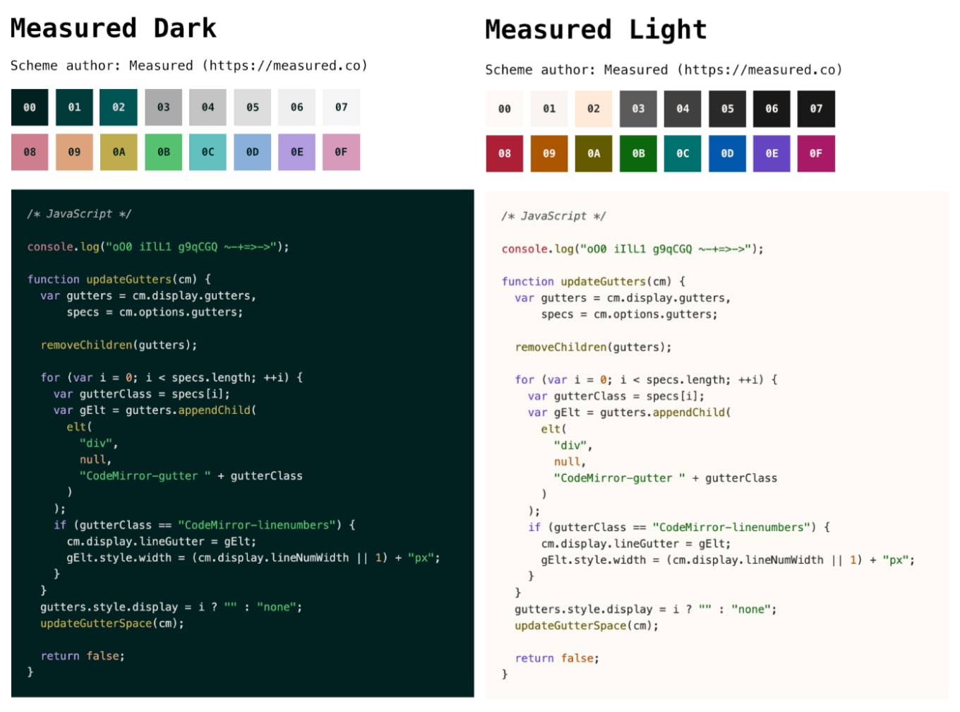
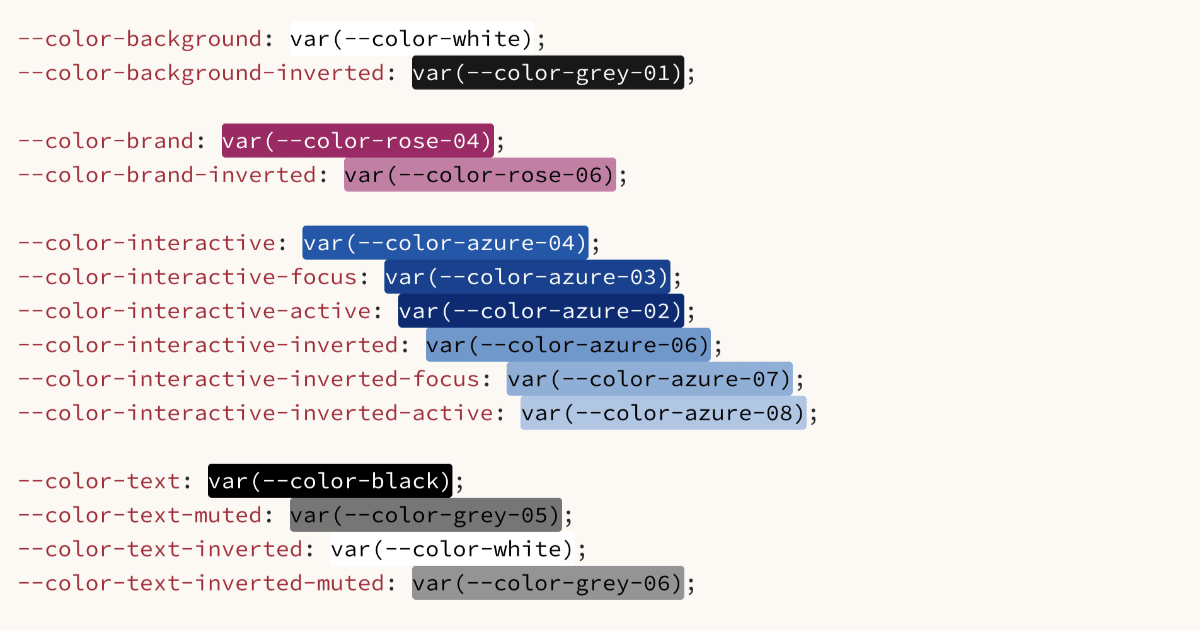
When we say visual, we don’t mean pretty. We’ve found showing design tokens as text strings helps make them tangible.</p>
<p>If you’re not familiar with design tokens, you can think of them as small pieces of a brand’s design system that are likely to be used again and again, like the font on a button. They’re easier to see than imagine:</p>
<p><img src="https://res.cloudinary.com/measuredco/image/upload/f_auto,q_auto/v1716535870/design_tokens_1200x630_ibdspo.png" alt="Screenshot from a code editor application showing CSS Custom Property design tokens for systematic colors"></p>
<p>So long as it’s interesting in some way, demo it. It’s OK to show a small unit of work. This works well if it’s something people have been asking for. It shows you listen and sweat the details.</p>
<p>But, if you don’t have at least 15 minutes of stuff to show, it’s not worth the time and effort.</p>
<p>For example, code refactoring is important work, but doesn’t make a good demo. Neither do things you’ve built and thrown away. Unless they contribute to a broader narrative, nobody cares. Gauge demo-worthiness by interestingness, not value.</p>
<h3 id="when-to-demo">When to demo</h3>
<p>Share things as soon as possible to get feedback early. Constructive feedback is like sunblock: better sooner than later.</p>
<p>Demo frequently. If a project is likely to run for a few months, weekly is great. On longer projects, we tend to demo every few weeks.</p>
<p>It’s OK to leave longer gaps over summer and winter festivities when people are less likely to be around, or as engaged. Trust your instincts around the organisation’s working culture.</p>
<h3 id="who-to-demo-to">Who to demo to</h3>
<p>Invite everyone who may have interest in your project, however tangential. Prompt attendees to let other people know.</p>
<p>In a big organisation, you won’t know everyone with a vested interest. Casting the net wide at the early stages gives you the best chance of winning hearts and minds, and can prevent friction later on.</p>
<p>If you build a regular audience, you build a positive culture around your demo series. That’s good for visibility and trust.</p>
<h2 id="who-should-present">Who should present</h2>
<p>Try not to demo alone. Bring at least one pal. Wrap your demo inside a short presentation with a slide deck. This will help you figure out who does what and when.</p>
<p>The deck should tee up the demo, set context, and invite questions and feedback at the end. A non-demoing team member can do these bits.</p>
<p>Have a person who helped design or build the thing do the actual demo. They’re best placed to show the detail, explain the rationale of your approach, and field questions.</p>
<p>At any one time, the person presenting should focus <em>only</em> on that. The other person can assume a support role. They can note any questions in chat, keep an eye on time, and deal with any issues that come up, technical or human.</p>
<p>It can be helpful to invite experts who aren’t part of your team. They can field broader questions about your project’s place in the organisation. You might invite engineers or brand people if your work has a bearing on their strategies.</p>
<h2 id="designing-your-deck">Designing your deck</h2>
<p>Your slide deck should introduce and set the context of your demo. It should explain:</p>
<ul>
<li>What you’re demoing</li>
<li>Its purpose</li>
<li>Goals it contributes towards (this is persuasive and powerful)</li>
<li>Why it’s relevant to the audience</li>
</ul>
<p>Our decks also have slides that:</p>
<ul>
<li>Show the agenda</li>
<li>Link to previous demo decks</li>
<li>Signpost the start of the demo</li>
<li>Signal changes in speaker</li>
<li>Show a roadmap of what’s next</li>
<li>Prompt audience questions</li>
<li>Let people know where they can follow progress</li>
</ul>
<p>You can’t control how your slides will be shared. Simple, concise slides are best, but each slide should have enough context to make sense to people who weren’t there.</p>
<p><a href="https://www.doingpresentations.com/">Doing presentations</a> has great advice for putting slide decks together. It’s optimised for “big” presentations, but there’s plenty you can apply to demos, including how to make your deck a useful stand-alone resource.</p>
<h3 id="how-much-to-prepare">How much to prepare</h3>
<p>It’s hard to know how much to prepare. A demo isn’t a high-pressure presentation like a sales pitch to a new client. But it does need to be clear and concise, so take as much time as you need to do that.</p>
<p>New teams and projects will mean more prep time, but it does get easier and faster. We can take a day or two to prepare to demo a new project. But we can get this down to a few hours as we find our groove.</p>
<h3 id="do-a-dry-run">Do a dry run</h3>
<p>Do at least one practice run with everyone involved. If possible, invite a few people you trust to be the audience. Ask for frank feedback about what worked and what didn’t.</p>
<p>Get a feel for how long it will take and find ways to make it shorter. Cut flab. If you’re clocking in at over an hour, it’s too long. Make it as short as it can be but as long as it needs to be.</p>
<p>Have a contingency in case technology fails on the day. If you’re demoing live software, you’d ideally have backup screenshots or a pre-recorded screen capture if you have time.</p>
<h2 id="the-practical-stuff">The practical stuff</h2>
<p>There are always practical considerations. A tricky one is cameras on vs. cameras off. As presenters, you should have cameras on.</p>
<p>If your work culture encourages it, you may like to suggest everyone attending has their camera on too. It’s easier to communicate, field questions, get feedback and gauge the vibe. But if the culture welcomes cameras off, do respect that.</p>
<p>You should also:</p>
<ul>
<li>Present from a quiet location</li>
<li>Present from a well-lit location (but avoid having bright light directly behind that makes you hard to see)</li>
<li>Use the best camera and microphone you have</li>
<li>Avoid emphatically banging your desk (which wobbles your camera)</li>
</ul>
<p>We choose to avoid blurring our backgrounds on calls when possible. That’s an aesthetic choice, and we know there are good reasons for people to mask their background. Do what’s best for you.</p>
<h2 id="doing-the-demo">Doing the demo</h2>
<p>Everyone presenting should join the call 10 minutes before start-time. If you’re demoing alone, ask a friend to join early. Test everything, including microphones, cameras and screen-shares.</p>
<p>If you’re using Microsoft Teams, it will announce to everyone that the meeting has started. You might like to drop a “no need to join yet” message into a channel.</p>
<p>Unless policy prevents, record the demo so people can catch up. If you’re presenting to a new organisation, check that this is OK. You may prefer not to record if the topic is sensitive. If you are recording, let everyone on the call know before you push the button.</p>
<p>The rest comes down to how you present and communicate. There’s a world of considerations to developing these skills. A few things we’d highlight:</p>
<ul>
<li>Pace is important — not too fast, not too slow</li>
<li>You’ll improve with practice (demos are a reasonably low-jeopardy way of developing presenting skills)</li>
<li><a href="https://www.doingpresentations.com/">Doing presentations</a> has great tips on the performance side of presenting</li>
</ul>
<h2 id="fielding-questions">Fielding questions</h2>
<p>Encourage questions, but on your terms. Decide in advance whether to allow them during the demo, or save them till the end. You may prefer to do them last if you’re presenting to:</p>
<ul>
<li>A new, unknown group</li>
<li>A large group</li>
<li>People you know may derail the demo (in a well-intended sort of way, of course)</li>
</ul>
<h3 id="sticky-wickets">Sticky wickets</h3>
<p>It’s OK to pivot to questions at the end if things get tricky.</p>
<p>A big risk is someone senior dominating with questions and feedback, or talking over your demo. If that person is an important stakeholder, you might decide to accept this. The important criterion is their role in your project, not their seniority.</p>
<p>If it’s not an important stakeholder, it’s best to politely but firmly insist on questions at the end. This will help your demo go smoothly, which is foremost a benefit to your audience.</p>
<p>An important skill to develop is being chill in the face of conflict. No one wants conflict, but it does happen. Being the unflappable person in the room will only build trust. That doesn’t mean having all the answers, but it does mean thinking before responding rather than reacting.</p>
<p>It helps to have your project spiel down pat. If questioned, be ready to articulate what you’re doing and why. These questions could come up when unfamiliar project teams and leads come along.</p>
<h3 id="duck-into-chat">Duck into chat</h3>
<p>You can prompt people to drop questions in chat. This can be distracting, but may be less so than letting chat go un-moderated. If you’re not presenting in that moment, reply to questions in the chat.</p>
<p>If someone voices a question when they shouldn’t, support the presenter by policing the situation. It will help them keep the thread.</p>
<h3 id="at-close-of-play">At close of play</h3>
<p>Leave at least 10 minutes for questions at the end. Less than that isn’t enough, and sends the message you’re not interested in feedback.</p>
<p>Let everyone know follow-up questions are welcome and where to put them. It’s good if this is in an open channel, so everyone can benefit.</p>
<h2 id="following-up-like-a-pro">Following up like a pro</h2>
<p>Put your helpful hat on as soon as the demo’s over. Copy-paste the chat history somewhere safe so you can follow up on unanswered questions, or ones you can now answer more fully. It’s a nice touch to re-share contributions and links shared by attendees too.</p>
<p>Share the slide decks with everyone straight after the demo — and not only with people who attended. Check your speaker notes first. Some may not be useful. Some may cause embarrassment.</p>
<p>If you have time, review the recording to check that spoken questions were answered well. You might like to re-share the spoken questions and answers in text format. Share the recording too.</p>
<p>Track follow-up conversations in chat and field any new questions that come up.</p>
<p>If your demo was one in a series, ask attendees to let other people know about future demos.</p>
<p>Not following up properly can undo effort you’ve put into demoing well. It shows you value people’s time, and their right to be informed.</p>
<h2 id="it-gets-easier">It gets easier</h2>
<p>There’s a lot to think about, but demos don’t have to be scary. If we’ve given the impression that demos take a lot of time, it’s because they probably will for the first few goes.</p>
<p>But it gets easier. With practice, you’ll hone skills, processes and tools. When there’s a hitch, remember that people probably won’t notice, and almost certainly won’t care. People are kind, patient and understanding.</p>
<p>Try to have fun. You won’t get everything right in the early stages. Every hitch is a chance to do it better next time.</p>
<p>We’d love to hear your thoughts. Get involved on <a href="https://bsky.app/profile/measured.co/post/3ktjzf3cdws2u">Bluesky</a> or <a href="https://www.linkedin.com/pulse/how-do-great-live-demos-why-theyre-important-get-right-measuredco-hpeoe/">LinkedIn</a>.</p>]]></content>
        <published>2024-05-22T00:00:00.000Z</published>
    </entry>
    <entry>
        <title type="html"><![CDATA[Why we’re called Measured]]></title>
        <id>https://measured.co/blog/why-we-are-called-measured</id>
        <link href="https://measured.co/blog/why-we-are-called-measured"/>
        <updated>2024-05-15T00:00:00.000Z</updated>
        <summary type="html"><![CDATA[Names are hard. We thought a lot about ours. We thought we’d share our thinking in case it helps people understand us better.]]></summary>
        <content type="html"><![CDATA[<p>Names are hard. We thought a lot about ours. We landed on Measured as the best reflection of who we are and how we work.</p>
<p>We thought we’d expand on that here, in case it helps people understand us better. (And, selfishly, we might be glad we wrote this down one day.) So: here’s why we’re called Measured.</p>
<h2 id="we-take-care-in-our-work">We take care in our work</h2>
<p>Whether it’s our approach to technology, design, strategy, or ways of working and communicating, Measured encapsulates our careful, precise approach.</p>
<p>As mantras go, we don’t love <em>move fast and break things</em>. We prefer <em>move fast and leave things better than you found them</em>. We don’t want to break things, and we want the people we work with to know that. It’s better, more responsible and faster in the long run to not break things.</p>
<p>Measure twice, cut once is the vibe.</p>
<h2 id="were-pragmatists">We’re pragmatists</h2>
<p>We have professional opinions, and we share them when it’s helpful. But we’re pragmatists, not ideologues; helpers not disruptors.</p>
<p>In our experience, strong opinions lead to heated discussions, and heated discussions end in logjams. We listen more than we speak, and we find the middle way (again, fastest). We always flex to the client’s unique circumstances.</p>
<h2 id="we-quantify">We quantify</h2>
<p>We’re goal-focused. We prioritise outcomes over outputs, and we favour those that can and should be measured.</p>
<p>We’re not blinkered about it. We don’t view metrics in isolation, ahead of everything else. But we value objective and transparent measures of progress. It makes our work accountable, validates good approaches, and helps us correct course when needed.</p>
<p>In truth, we weren’t thinking about metrics when we came up with the name, but it works, even if it’s something of a <a href="https://en.wikipedia.org/wiki/Retroactive_continuity">retcon</a>.</p>
<h2 id="were-craftspeople">We’re craftspeople</h2>
<p><a href="https://fonts.google.com/knowledge/glossary/measure_line_length">Measure means the length of a line of text</a>. So we started using <code>measured</code> and <code>isMeasured</code> in our code as property and class names. It indicates that a piece of text should have its line-length restricted for readability rather than filling the width of its container.</p>
<p>In other words, Measured is a small doff of the cap to the craft of what we do.</p>
<p>We’d love to hear your thoughts. Get involved on <a href="https://bsky.app/profile/measured.co/post/3ksmjuc5qsk2i">Bluesky</a>.</p>]]></content>
        <published>2024-05-15T00:00:00.000Z</published>
    </entry>
    <entry>
        <title type="html"><![CDATA[Let’s catch up at this year’s State of the Browser]]></title>
        <id>https://measured.co/blog/catch-up-at-state-of-the-browser</id>
        <link href="https://measured.co/blog/catch-up-at-state-of-the-browser"/>
        <updated>2024-05-08T00:00:00.000Z</updated>
        <summary type="html"><![CDATA[We’ll be going along to State of the Browser in London in September 2024.]]></summary>
        <content type="html"><![CDATA[<p>We’re happy to share that we’ll be going along to this year’s <a href="https://2024.stateofthebrowser.com/">State of the Browser</a>!</p>
<h2 id="essential-details">Essential details</h2>
<ul>
<li>Saturday, 14 September, 2024</li>
<li>9:30 am–5:00 pm</li>
<li>Barbican Centre, London (<a href="https://www.google.co.uk/maps/place/Barbican+Centre/@51.5209863,-0.0957614,17z/data=!4m6!3m5!1s0x48761b56fb64b275:0xc756e26675d21f40!8m2!3d51.5202077!4d-0.0937864!16zL20vMG02cTY?entry=ttu">Map</a>)</li>
<li><a href="https://2024.stateofthebrowser.com/tickets/">Ticket information</a></li>
</ul>
<h2 id="about-the-event">About the event</h2>
<p>In case you’ve never been, State of the Browser is an excellent one-day event organised by the lovely and talented people at <a href="https://londonwebstandards.org/">London Web Standards</a>.</p>
<p>There are a variety of talks about things like web standards, accessibility, and the state of the modern web in general.</p>
<p>The talks are never not insightful, and it’s a great chance to catch up with web industry people. We highly recommend—hence this post.</p>
<h2 id="talk-to-us">Talk to us</h2>
<p>The reason we’re sharing this is that we’ll be going and would love to catch up with you.</p>
<p>Possible topics of conversation:</p>
<ul>
<li>Weather</li>
<li>What you’ve been working on</li>
<li>Your UI and branding headaches</li>
<li>Weather</li>
<li>Design and UI systems generally</li>
<li>Accessibility</li>
<li>Coffee?</li>
<li>Weather</li>
</ul>
<p>But other than that, we’re pretty relaxed about conversational subject matter.</p>
<p>We don’t plan to speak at the event, but a big thanks to State of the Browser for letting us sponsor.</p>
<p><a href="https://2024.stateofthebrowser.com/tickets/">Grab a ticket</a>, perhaps?</p>]]></content>
        <published>2024-05-08T00:00:00.000Z</published>
    </entry>
    <entry>
        <title type="html"><![CDATA[Accessible syntax highlighting colour schemes for developers]]></title>
        <id>https://measured.co/blog/accessible-syntax-highlighting-colour-schemes-for-developers</id>
        <link href="https://measured.co/blog/accessible-syntax-highlighting-colour-schemes-for-developers"/>
        <updated>2024-04-18T00:00:00.000Z</updated>
        <summary type="html"><![CDATA[Why we designed and released two Base16 colour schemes for publishing code on the web.]]></summary>
        <content type="html"><![CDATA[<p><img src="https://res.cloudinary.com/measuredco/image/upload/f_auto,q_auto/v1713427188/measured-base16-SoMe-1360x1032_mnyufx.jpg" alt="Measured Base16 colour schemes with code examples"></p>
<p>When we started Measured, we knew we’d want to write things about technical aspects of our work. Inevitably, that means publishing code snippets.</p>
<p>We built our website to comply with <a href="https://www.w3.org/WAI/WCAG2AA-Conformance">WCAG AA accessibility</a>, so we needed our code snippets to comply too. That meant applying a colour scheme to snippets to comply with the WCAG requirements for contrast.</p>
<p>More than that, we actually needed two schemes because our website adapts to visitor system preferences for day and night modes.</p>
<p>When we went looking at colour schemes already out there, we ran into one of two issues:</p>
<ol>
<li>They weren’t AA-compliant</li>
<li>They were visually jarring (and in a way that wouldn’t work alongside our existing brand colours)</li>
</ol>
<p>So <a href="https://www.linkedin.com/in/scottboyle/">Scott</a> set about creating them instead. We collectively decided to release them as open source in case people shared our need for AA-compliant Base16 schemes that, not to put too fine a point on it, also look quite nice.</p>
<p>They’re <a href="https://github.com/measuredco/base16-measured-scheme">available on GitHub</a> for anyone to use. The obvious use cases are for either writing or publishing code, but the underlying schemes could be used for any lightweight web project.</p>
<h2 id="notes-on-development">Notes on development</h2>
<p>A few more points for anyone interested in a bit more detail:</p>
<p>We didn’t start from scratch. We used <a href="https://ethanschoonover.com/solarized/">Solarized</a> as the basis of the project. It didn’t meet AA criteria, but it did give us a good platform to build from. From there, we essentially adapted our brand colours to meet Base16 needs.</p>
<p>Once we’d decided to share the schemes, we were keen to contribute to the Base16 ecosystem. To that end, we submitted pull requests to a couple of GitHub projects with mixed success. But the schemes are now included at <a href="https://github.com/tinted-theming">Tinted Theming</a>.</p>
<p>We’ve assumed this project will potentially interest developers, so we haven’t included much hand-holding in the <a href="https://github.com/measuredco/base16-measured-scheme/blob/main/README.md">README</a>. That said, we did want to make this work immediately useful, so the repo includes files to get the schemes working with widely-used tools. Specifically:</p>
<ul>
<li><a href="https://github.com/measuredco/base16-measured-scheme/tree/main/built/styles">CSS and extensions</a></li>
<li><a href="https://github.com/measuredco/base16-measured-scheme/tree/main/built/highlightjs/themes">highlight.js</a></li>
<li><a href="https://github.com/measuredco/base16-measured-scheme/tree/main/built/iterm2/itermcolors">iTerm2</a></li>
<li><a href="https://github.com/measuredco/base16-measured-scheme/tree/main/built/jetbrains/colors">JetBrains</a></li>
<li><a href="https://github.com/measuredco/base16-measured-scheme/tree/main/built/vscode/themes">Visual Studio Code</a></li>
</ul>
<p>We don’t plan to do more work on this project, but we welcome contributions. There is scope to support more tooling, for example.</p>
<p>You can start using the <a href="https://github.com/measuredco/base16-measured-scheme">Base16 Measured Scheme via the GitHub repo</a>.</p>]]></content>
        <published>2024-04-17T00:00:00.000Z</published>
    </entry>
</feed>